
January 4, 2021 - it was the first day back to work in a new year. I was given a 250 page PDF of documented Zelle® flows and asked to translate the designs into our design patterns and look for areas where the experience could be improved. Each page was to be replicated in our patterns and submitted to both FiServe (or development partner) and EWS (owners of Zelle® brand) for approval.
Zelle® is huge - it is a whole P2P payment app within a banking app. The timeline to launch was fast, and the ask was to have it delivered no later than Q2.
I was lead designer for this project and oversaw the work of one other designer, a content strategist, and a researcher.
I managed both backend design system work and front end of moving Zelle® forward.
I kept track of several hundred screens and designed dozens of new components. I also identified where to leverage the API to make our Zelle® experience unique and better for our users.

Early Warning Services (EWS) is the fintech company who owns Zelle®. EWS is owned by seven of America's largest banks, giving it a unique market position to enable individuals to electronically transfer money from their to another registered user's bank account using a mobile device or the website of a participating banking institution. Unlike Venmo and other P2P money movement services, Zelle® eliminates the third party by allowing funds to be immediately available in a user's bank account.
EWS has a strict set of guidelines regarding the implementation of Zelle®. While participating banks are allowed to apply their design system to customize the look and feel of Zelle®, there are constraints around the main flows, required UI elements, copy, and what can/cannot be done. There are over 200 documented flows in the EWS guidelines that cover everything from happy paths to error flows and search behavior. I found that while the guidelines were comprehensive, they were not complete in covering every possible use case. Each flow has to be submitted to EWS for approval before a bank can launch Zelle®.
Bank of the West had a current implementation of Zelle®, and it wasn't too pretty. The first build of Zelle® in the mobile app was not a native experience and framed into the app through a web browser. This not only created slow load times, but also caused some confusing experiences. For example, the 'Cancel' button in upper right corner in Send and Request flows would not cancel the transaction (expected behavior) but actually take you out of Zelle® entirely and land you back on the Payments Homepage.
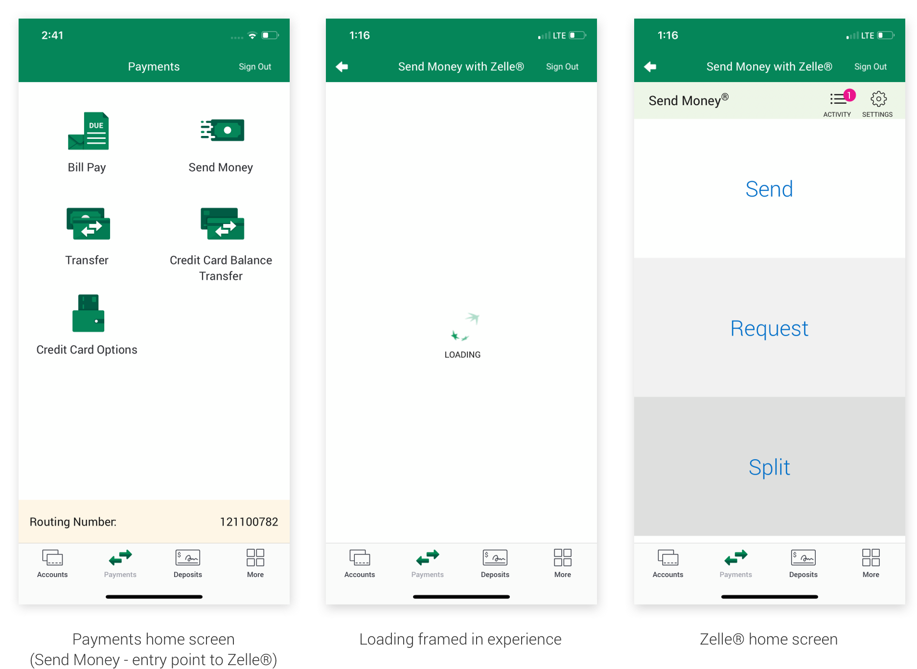
The lack of visual hierarchy also muddled the experience quite a bit. The design patterns that had been developed since I began working on mobile over a year ago were not in place in the experience, making it feel disconnected from the rest of the app as well as the Bank of the West brand.
The Zelle® redesign was an exciting opportunity for the bank because we were able to rebuild it in React Native. The rest of the mobile app is a combination of codebases and framed in browser experiences. By building in React Native, the experience would automatically be faster (no load time), and we were able to finally get developers on board with building the components of the design system I'd been working on for the past year and a half.
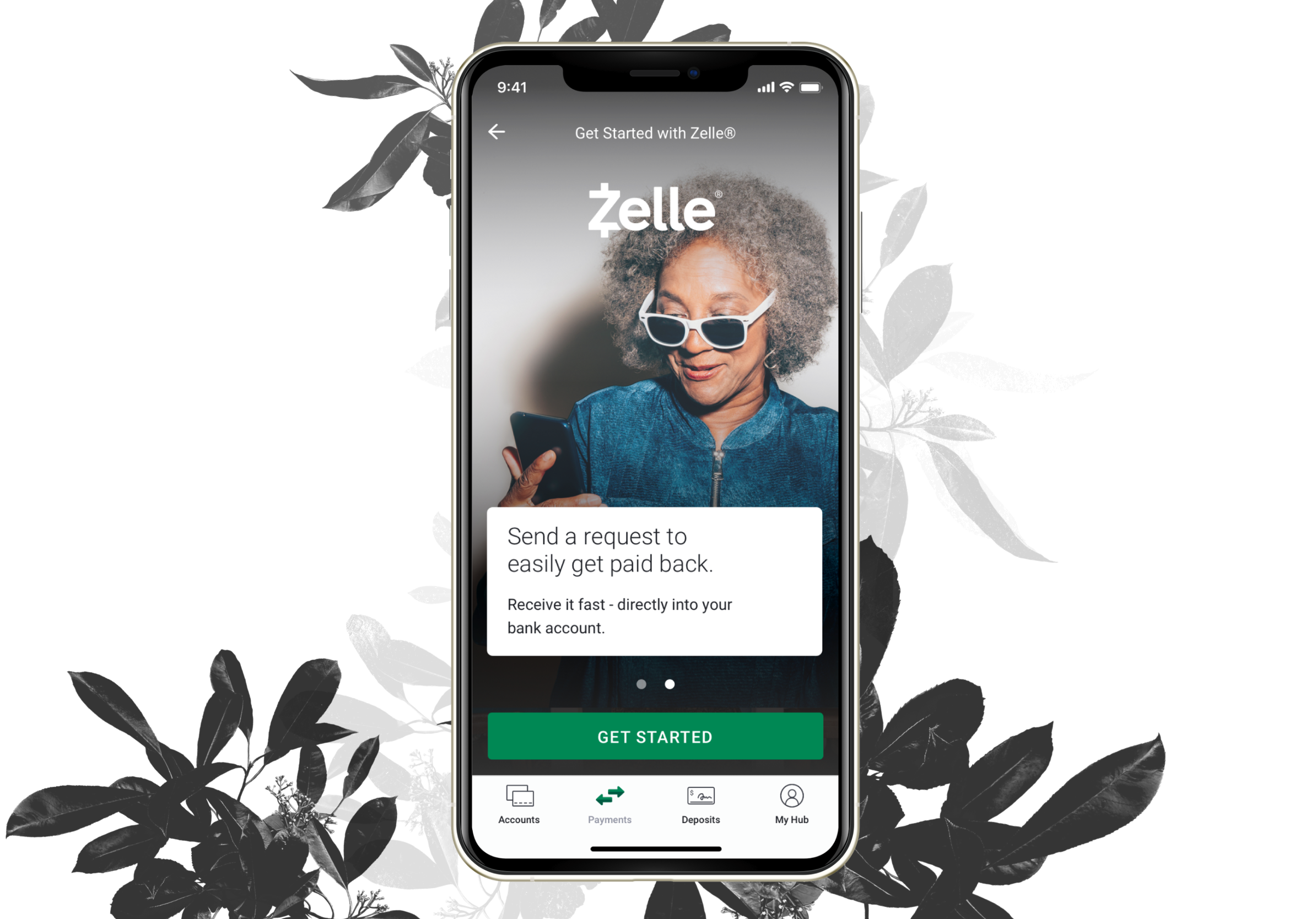
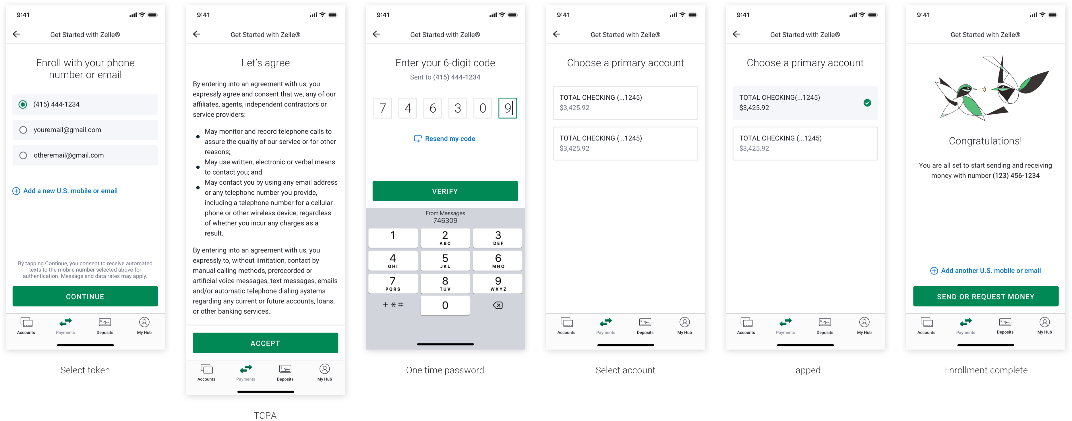
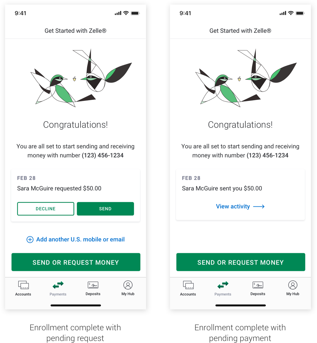
It all begins here - while Zelle® is offered with most major banks, it still requires users to enroll before they can use the service. Some key highlights from this process were:
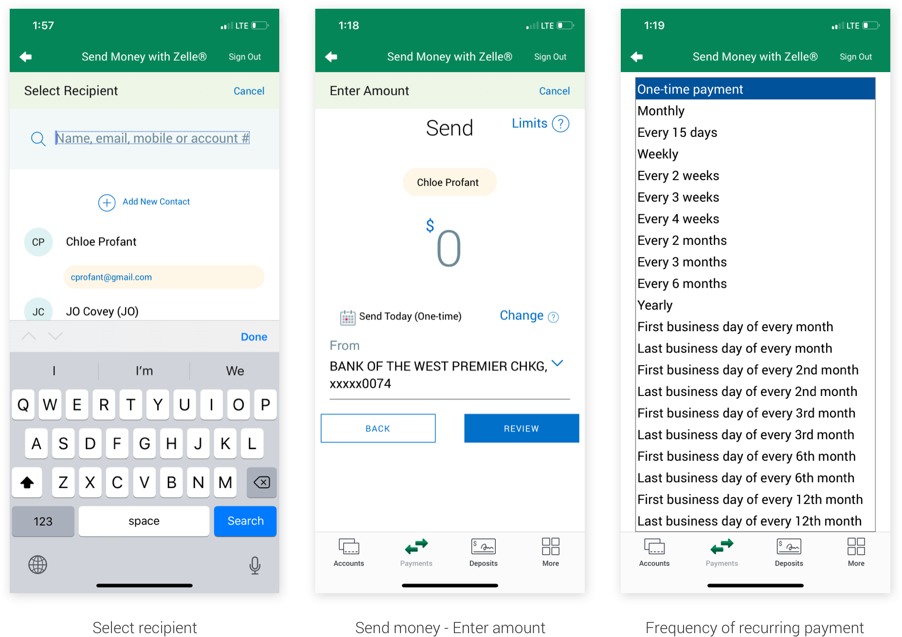
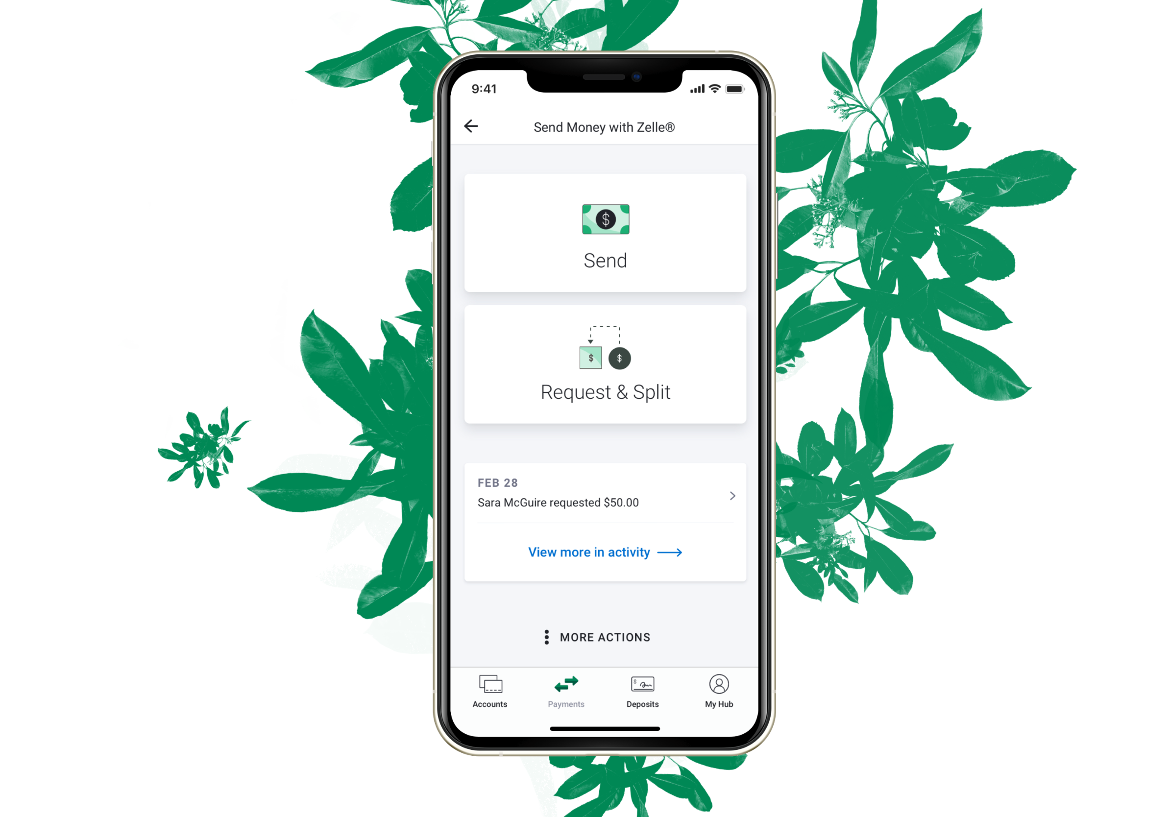
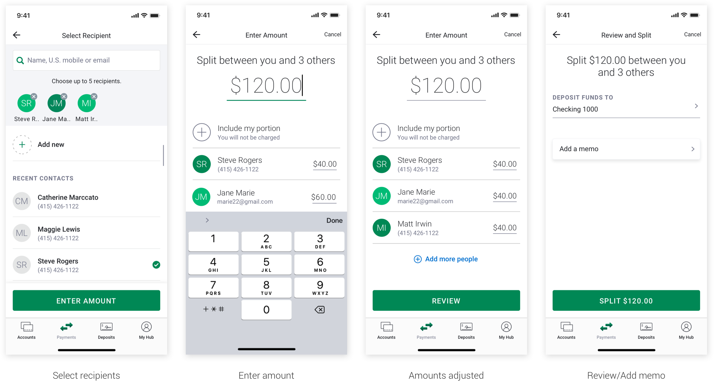
By far the most popular flow in Zelle® is sending money. Variations on this flow included setting up recurring payments (weekly, monthly, etc.), paying an unknown recipient vs. a known recipient, and adding a memo. Entry point begins with the 'Send' button from the Zelle® home screen.
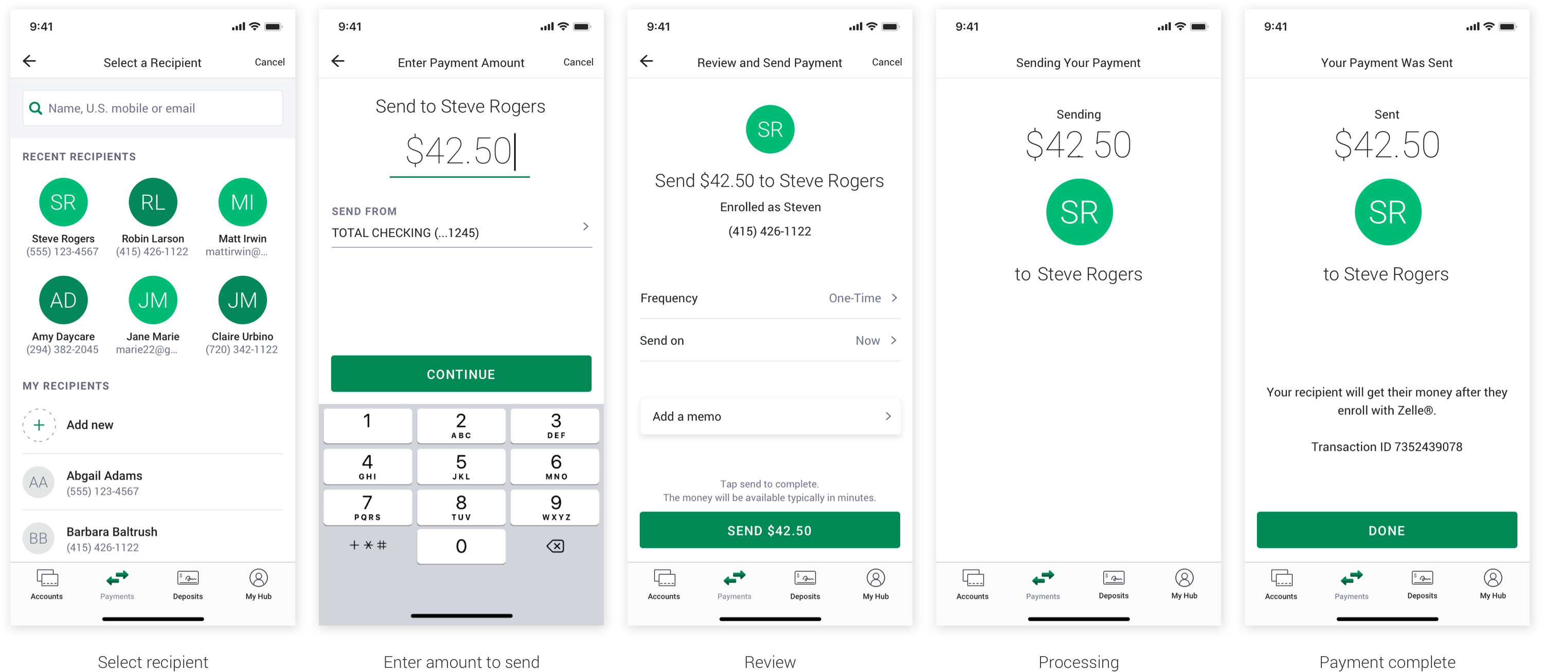
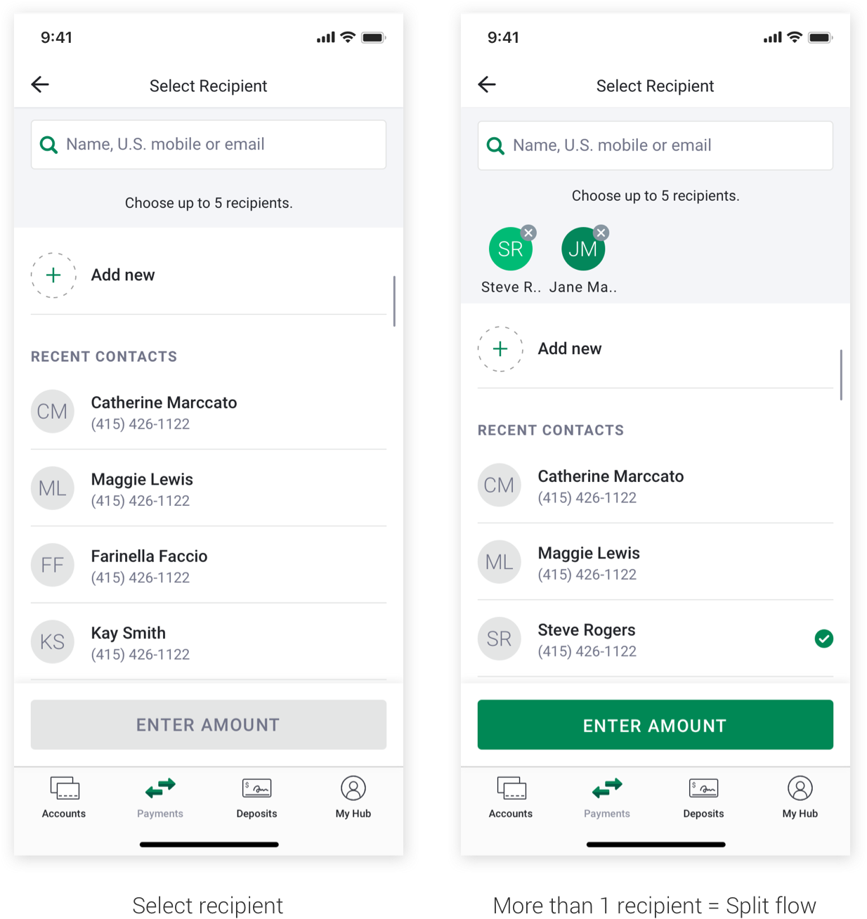
A lot of people ask if it makes more sense to select a recipient first instead of sending or requesting money. This is one of the main constraints of Zelle® - that the core flows cannot be changed. Regardless of whether it makes more sense or tests better one way or the other, EWS is inflexible around switching up the core flows of Enrollment, Send, Request, and Split.
EWS separates Request and Split flows in the guidelines. However, upon working with these flows, I realized that Split is just sending requests to multiple people while Request sends to only one. I found that it was viable to combine them with some tweaks to the Select Recipient page.
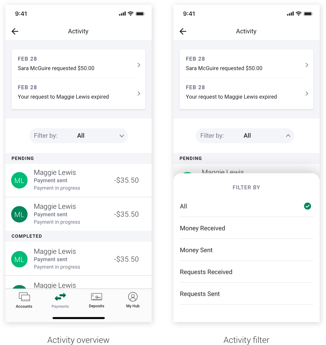
EWS had their activity feed structured in a way that makes sense at first glance, but in reality allows important information to get buried. EWS suggested to filter Zelle® transactions into 'All', 'Payments', and 'Requests'. So, money you sent and money sent to you are all in one folder; requests you sent and requests sent to you also went in one folder. I felt this was similar to having your inbox and sent messages all in one and would be confusing to a frequent user.
I restructured the filter to categorize by 'All', 'Money Received', 'Money Sent', 'Requests Received', and 'Requests Sent' to allow people to find their payments and requests with ease. Highlighted info for the feature up top was never fully explored, but next steps were to see how we could scale the UI to fit multiple action items (expired payments, pending requests, declined requests).
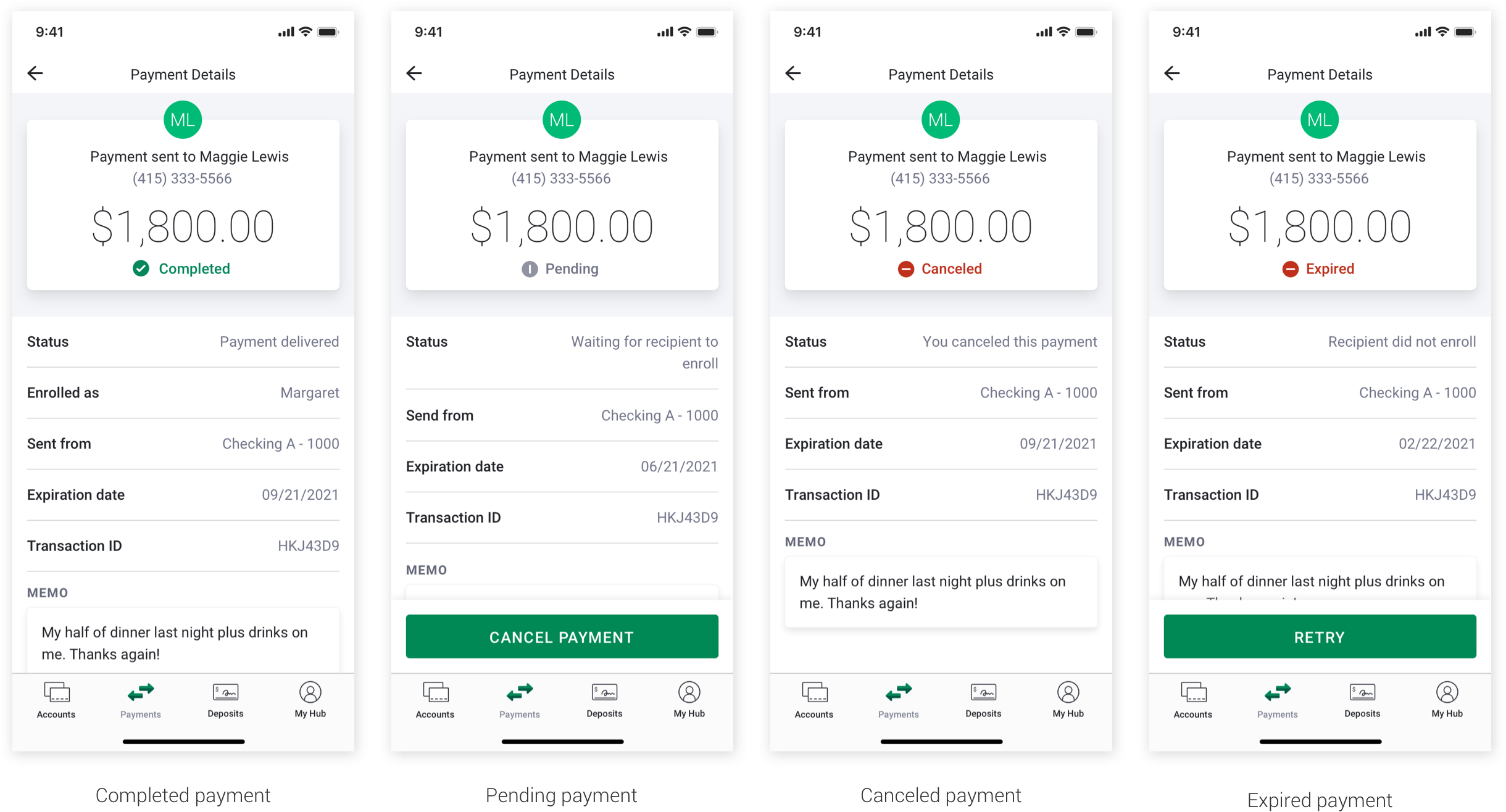
Finding the right pattern for the Payment Details page took some time. EWS required mandatory elements and information on this page, and some of the text in the fields broke existing design patterns. In the end, we found a structure that could accommodate a variety of payment/request states and secondary actions.
While I did not work on these screens directly, I oversaw the design process and guided my teammate to make them in alignment with the rest of the designs and consistent in their patterning. The illustrations are animals from the American West that are either endangered or extinct and nod to the environmental and sustainability messaging from Bank of the West.
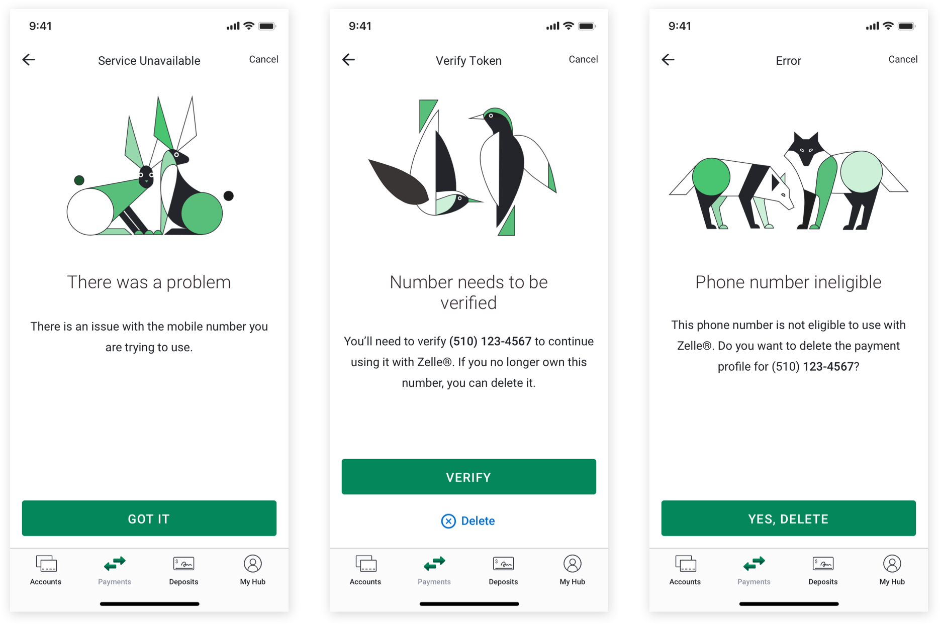
We were able to standardize the screen with different text formatting based on the amount of content. We also had to accommodate for primary and secondary actions related to the error.
One of the neat things about this project was that the touchpoint of these designs was actually much larger than just Bank of the West. Because we were working on FiServe's implementation of Zelle®, we were actually positioned to make their Zelle® integration with enhancements. FiServe would then implement their Zelle® integration in the participating banks they serve. If you're finding this confusing, you're not alone, it's totally confusing.
What this means is that my design enhancements to Zelle® would be implemented beyond Bank of the West and extend to other financial institutions who use FiServe. Eventually, the touchpoint could extend to millions of users.
There were a lot of ideas floating around on how to enhance the Zelle® experience within the parameters of the EWS guidelines and using information that was already leveraged elsewhere in the app. My favorite of these ideas was leveraging information around pending requests in Enrollment and highlighting that on the home screen and activity page.
The current Zelle® experience gives a highly visible entry point to Requesting money, however, receiving a request on the other side is a fairly buried experience. The recipient of a request must look in their activity feed to find it - and if the request was sent a while ago, they might have to scroll back a bit to find it.
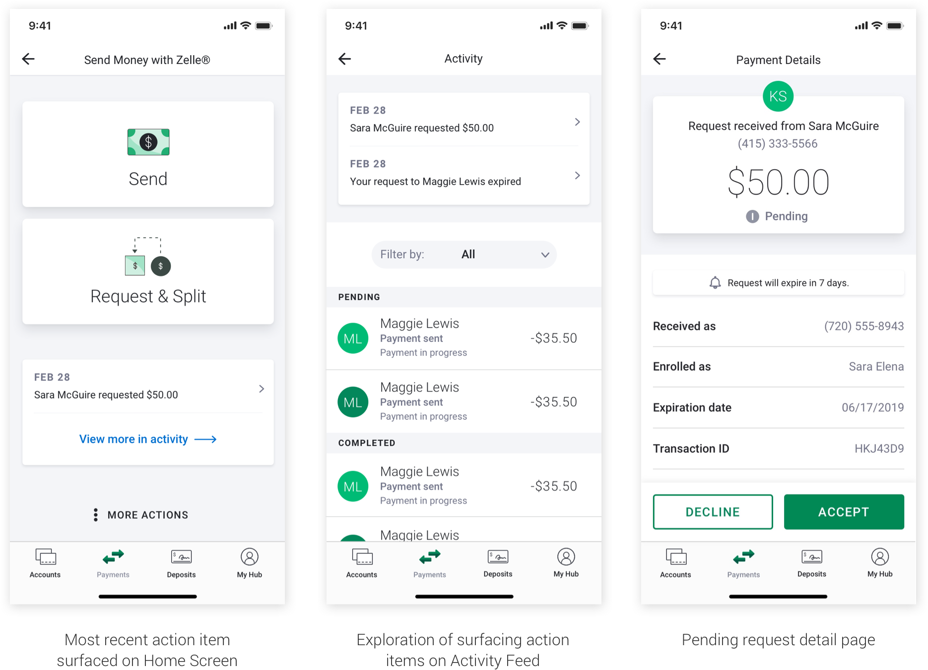
Because we were able to combine Request & Split flows, this opened up space on the homepage for something new. I personally think surfacing even one recent request brings the most value to a user while also being a viable MVP solution since EWS already requires a pending request to be surfaced on Enrollment completion page. By repurposing information that was already surfaced elsewhere, I felt this was a strong proposal for a new feature that provided a window into receiving payment requests that was not there before.
This was a project that pushed my capabilities as a designer. I did backend design system work and front end production work simultaneously, I directed other designers and a content strategist, I kept track of thousands of screens in hundreds of flows. I found order in the craziness by giving myself structure in how I work and organize my files, components, and schedule. I figured out healthy boundaries and spoke up for myself. I advocated for my work and the work of others. Even though this whole project got completely lost in corporate politics, I came out empowered and knowing what I am capable of as a designer.