I was the first designer at alka and started working with the company when it was only an idea. The app launched six months after we began working on it. I tailored this case study to focus on the development of our most significant feature, Smart Balance.
I worked with the founder to figure out the initial features of alka. I designed the interactions of these features and tested them with users. I established the brand voice in email, blog, and landing page campaigns. I also contributed to the creation of alka's design system.
"Let's build a better Mint!" -Tony Xiao, Founder & CEO of alka
Tony is a talented engineer with boundless energy and a passion for FinTech. Despite actively using many personal finance products over the past 9 years to keep track of his thirty-plus accounts, he was surprised when one day he found out that there was almost no money in his checking account. "I didn't like it!" he says. "None of these products could accurately tell me where I had spent my money, or for how long I had been overspending - I had no idea!" Frustrated that nobody had figured out a great solution to daily financial management, Tony decided to start his own company.
Tony initially asked me to help him for a month to figure out if he could be on to something. I ended up working for the next six months to bring alka from general idea to a scoped product that launched in the App Store.
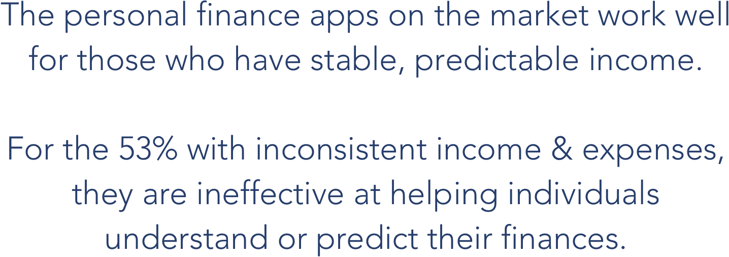
The App Store is crowded with apps to help you better manage your money. Could it really be that none of them have gotten it quite right?
I wanted to know how others were managing their finances, what tools they were using, and what their pain points were around money. My research consisted of:
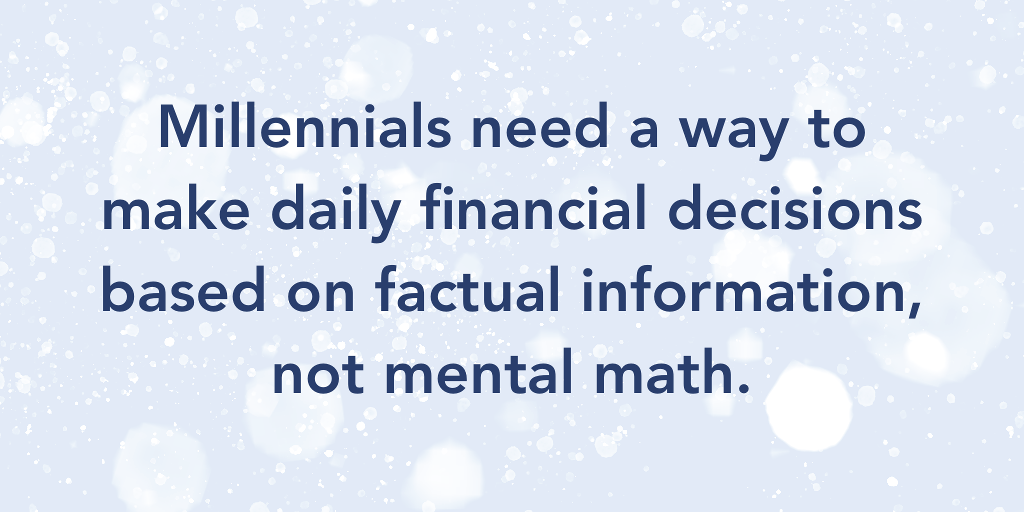
My findings from this research confirmed that yes, there are many problems to tackle in the personal finance industry that are not being addressed by the market currently. We decided to focus on daily finances, specifically for Millennials.
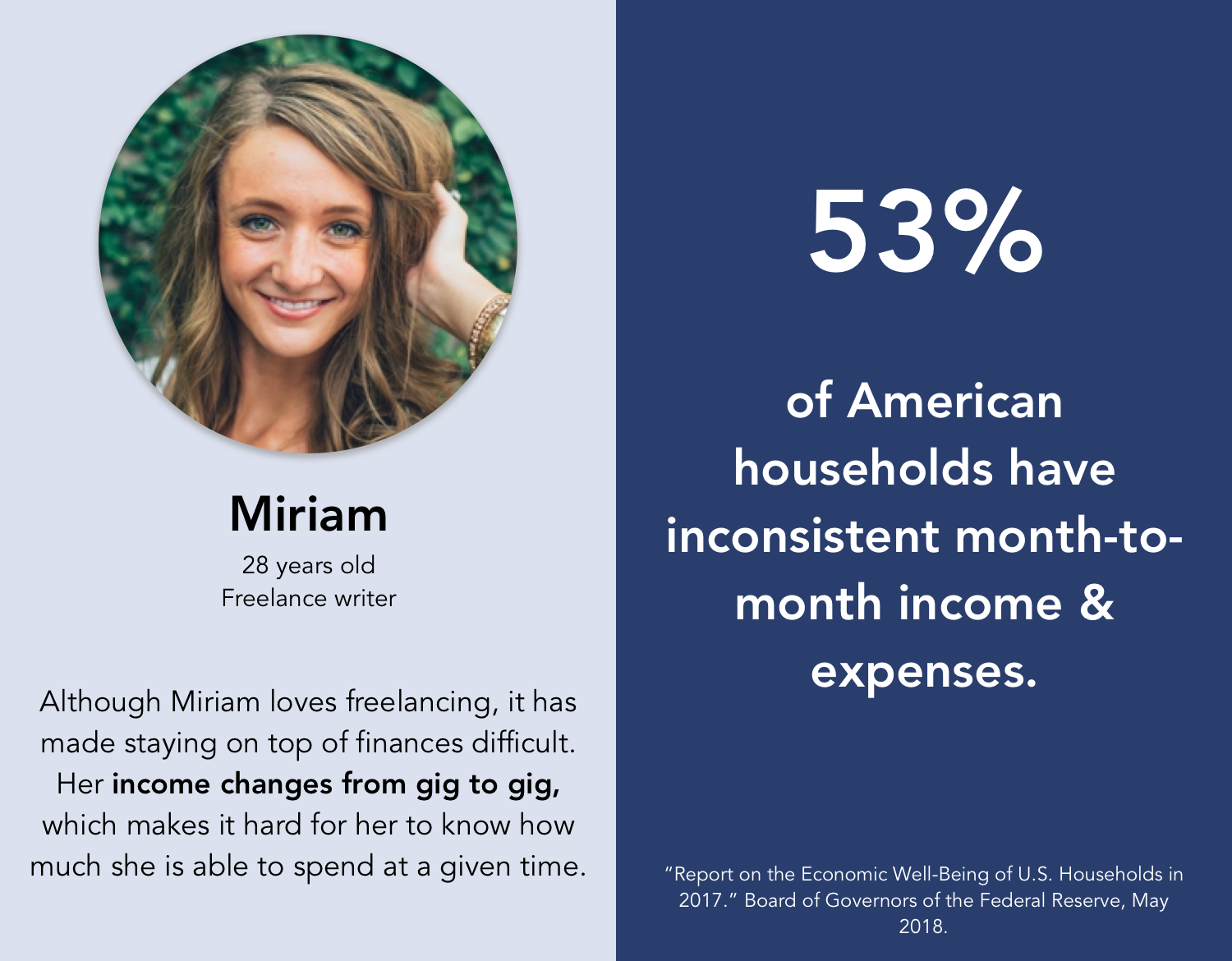
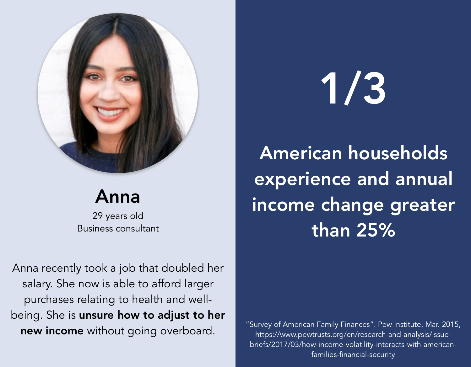
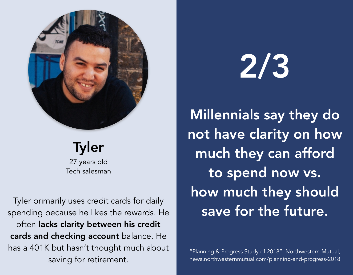
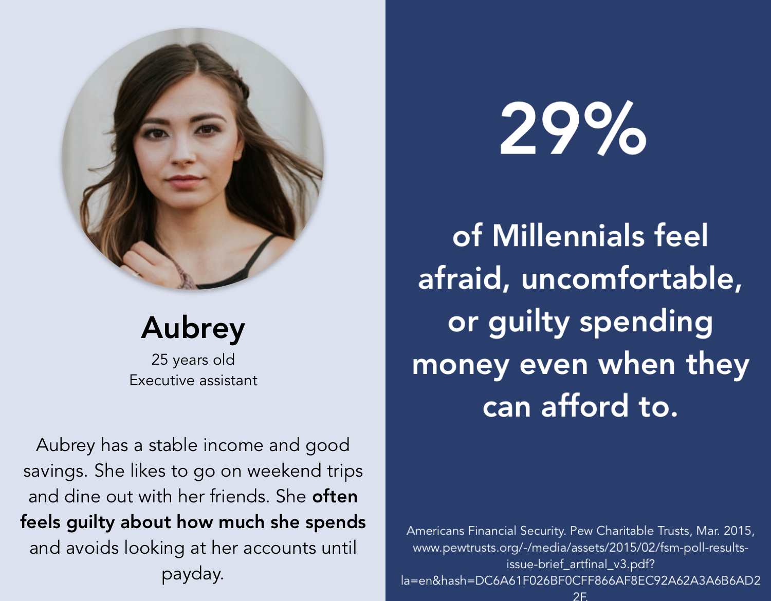
The majority of the people I interviewed were Millennials. Tony & I agreed this demographic would be likely to feel more open about linking their financial accounts and research suggested they are open to learning more about personal finance. Below are profiles of their combined stories, paired with statistics from nation-wide research.
Key takeaways from this phase were:
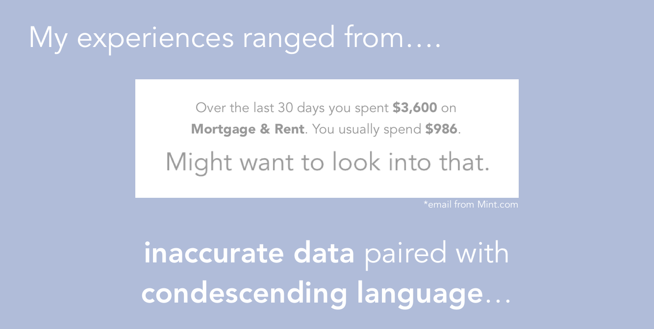
I tried roughly twenty apps relating to personal finance and expense tracking in my first month on the project. Of those, I actively used Mint, Clarity Money, Empower, WealthFront, Quickbooks, Credit Karma, Veryfi, Splitwise, and NerdWallet.
I paid the closest attention to apps that focused on aggregated wealth and budgeting such as Mint, Clarity Money, and Empower. I did not find these to be useful for day-to-day spending because:
In contrast with user research and nationwide data, I concluded:
Money causes a lot of people stress. I decided to assess the apps based on how they made me feel.
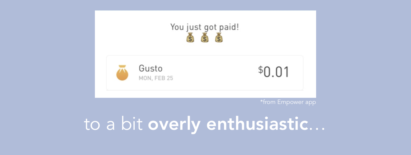
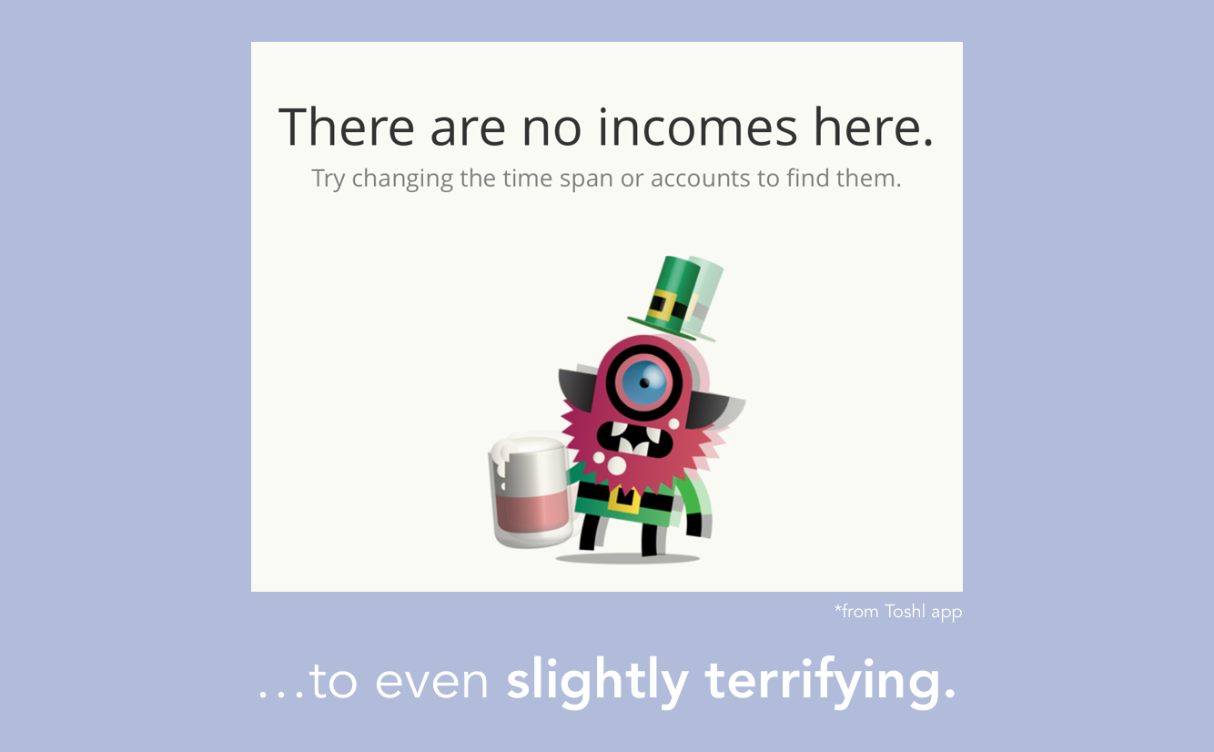
I noticed that the majority of the personal finance apps I tried didn't alleviate my own constant worries about money and sometimes they made me feel bad about what money I did have.
Noticing the shortcomings of the personal finance market to address the emotional aspect of money pushed us to explore what it would mean to prioritize emotional health around money. I talk more about that process and how we integrated mindfulness into our core product, design philosophy, and brand voice here.
I did find some products to draw inspiration from, specifically Simple Bank and Superhuman.
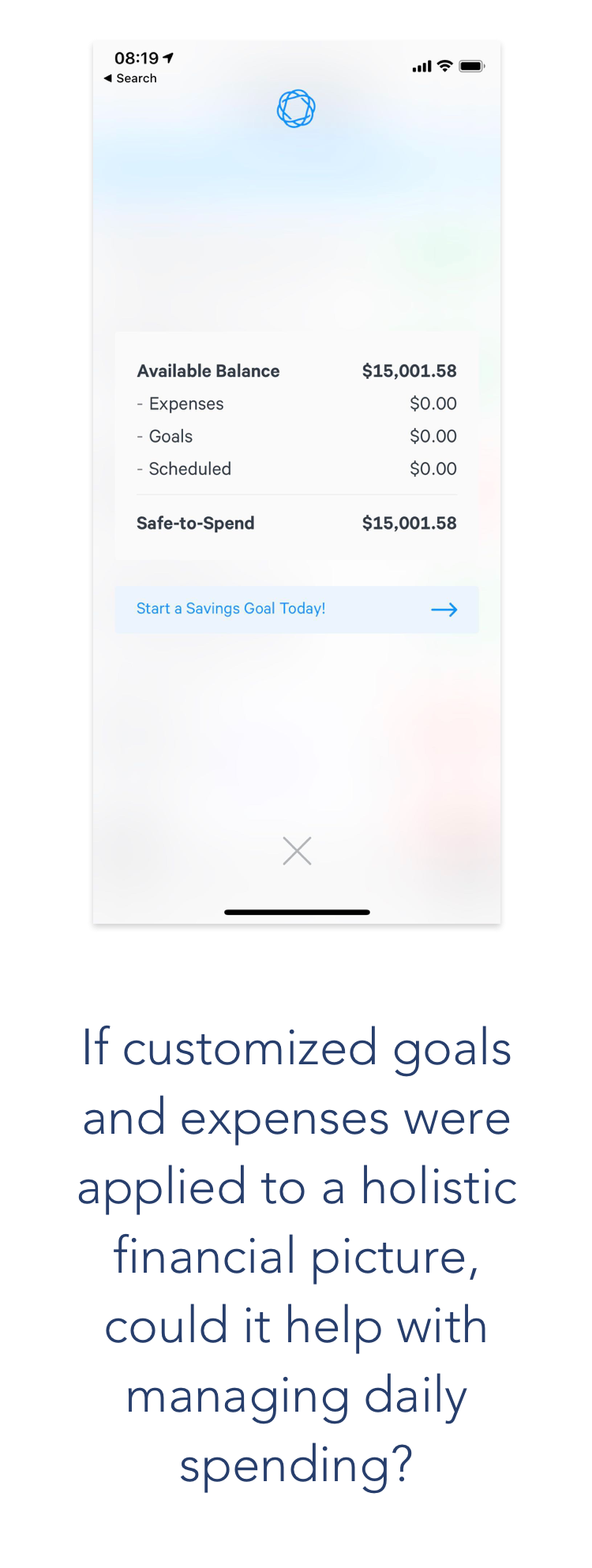
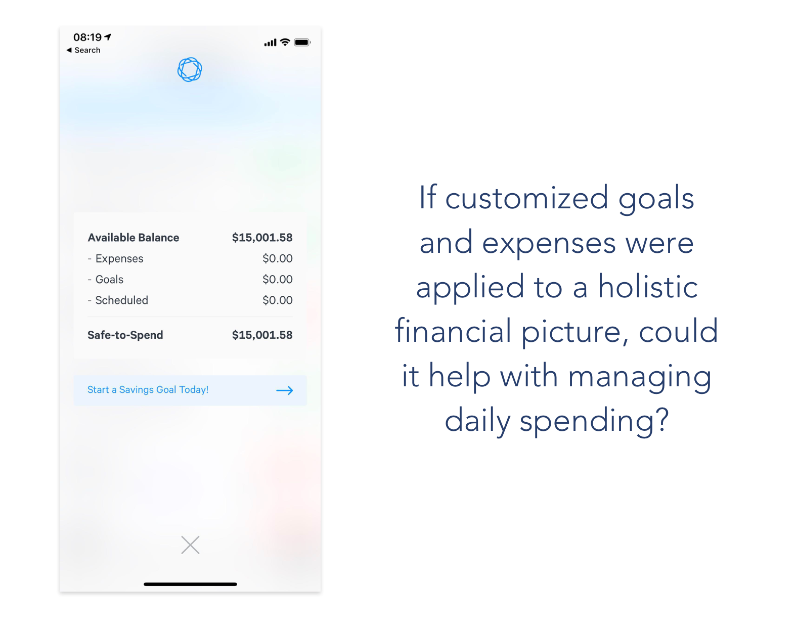
Simple is an online-only bank account with a feature called Safe to Spend that takes the balance in a user's Simple account and subtracts custom financial goals and monthly expenses. Unfortunately, it is isolated to those who have a Simple account and does not integrate with other financial institutions. We liked this and wanted to build a more holistic experience that was inclusive to all financial institutions.
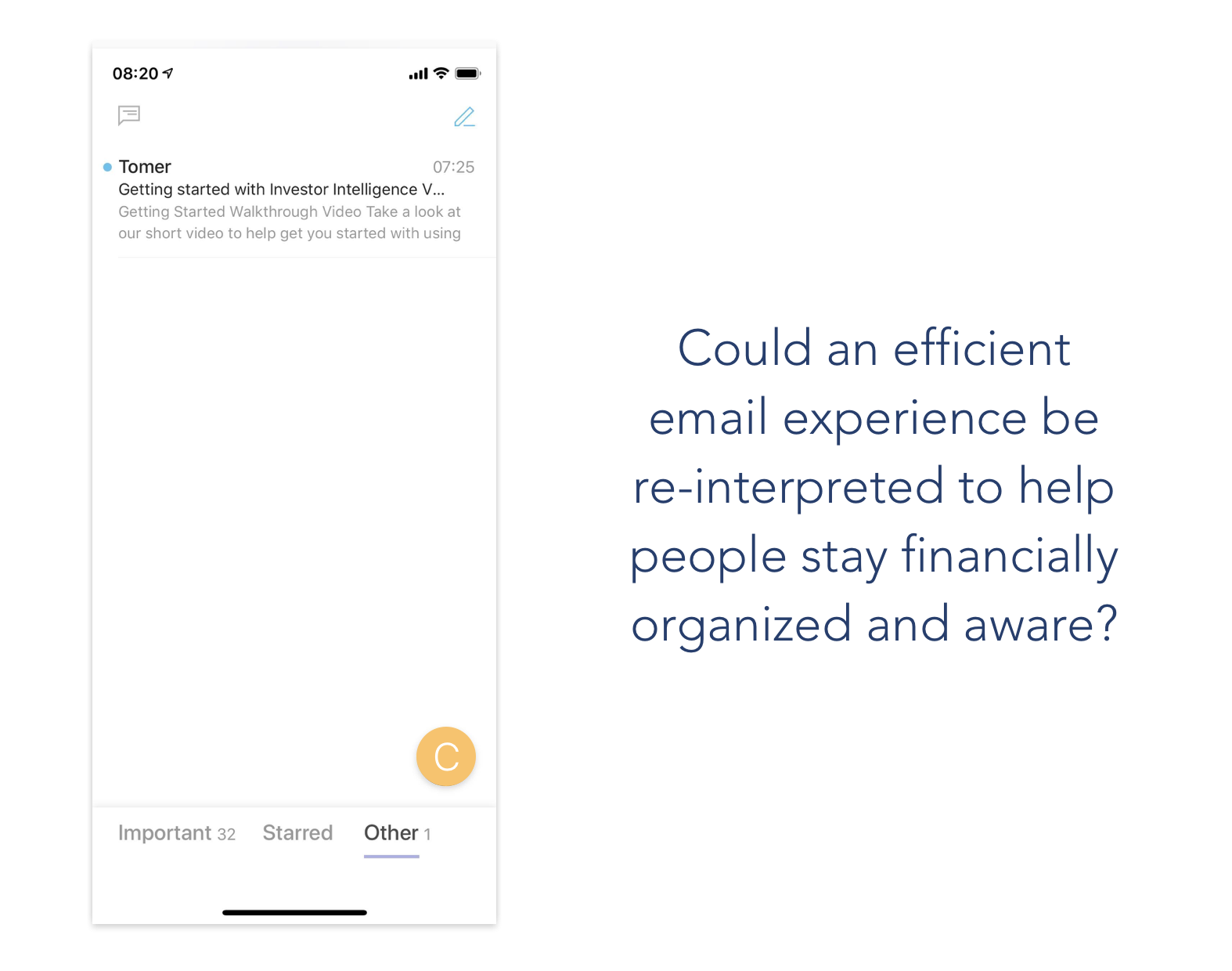
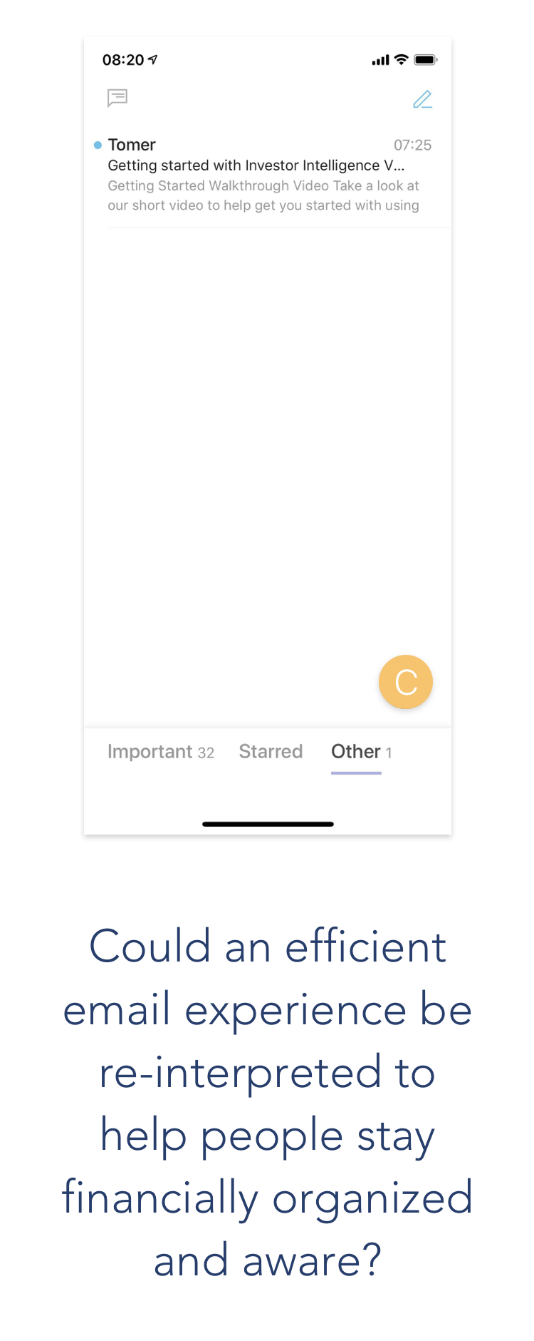
SuperHuman is a startup that created the fastest, most efficient email experience to date. We wanted to test whether interpreting a tool like email for financial data could lead to a more organized financial life.
While I had been researching, Tony had coded an 'app' I could log into with my phone number and link my bank accounts to. It uploaded my transactions and sent me a notification when there had been account activity. That was it: combined transaction list and push notifications.
Tony, enthusiastic as ever, decided to move forward with getting a slightly more enhanced version of this onto a platform where we could onboard users willing to test out our ideas. "We're going to need an app anyway, I might as well build something people can use!" he told me when I proposed prototyping and usability testing before he spent hours coding. In hindsight, this was actually a great call: we needed people to interact with the app over time to know if the product was having the right impact.
Having a beta program allowed us to test out our ideas with users and find out what worked. After linking all their financial accounts, our beta testers helped us test the following features:
The deeply disappointing reality of working as a designer for a super-early-stage startup is that the product is not going to look pretty. At least not at first.
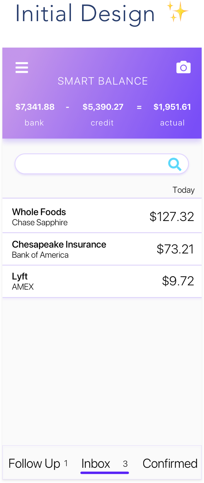
Engineers have a lot on their plate. It's not that our engineers didn't care about design, they just didn't have the time to make designs pixel-perfect. I learned that it doesn't matter what the product looks like if it doesn't work to begin with. Your designs will never be seen if you don't have a way for people to onboard themselves, nor will they want to keep using the app it if it keeps breaking.
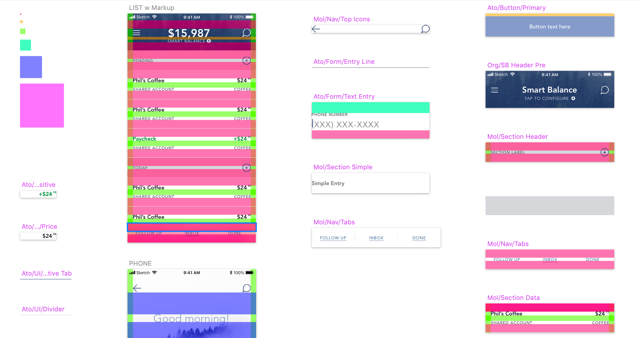
We needed a UI structure that would allow the team to iterate and build things quickly. Using Google Material gave us the structure that we needed at the time. I adjusted my designs to work within that framework for several months.
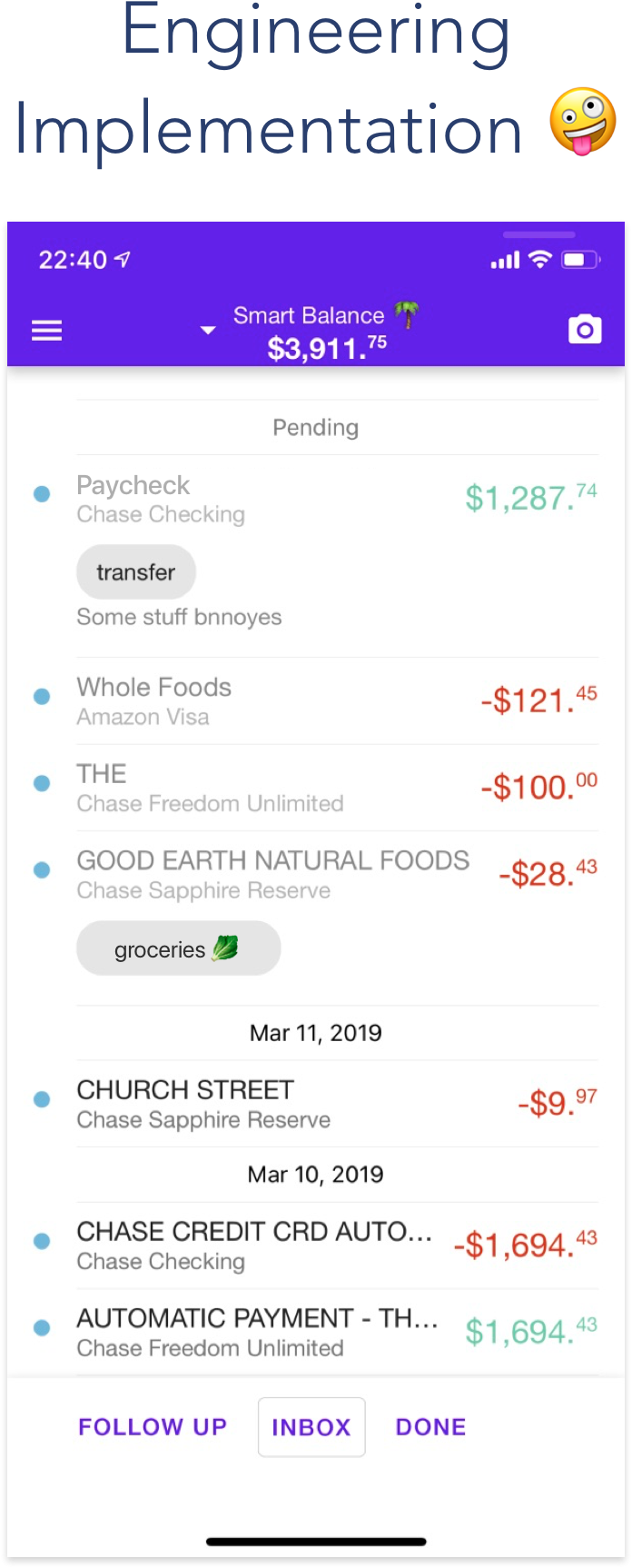
Two weeks before the launch, it became evident that alka's brand messaging was not in alignment with the visual appearance of the app. I worked with Danny Smith, who came on as alka's CoFounder about three months in, to create alka's design system.
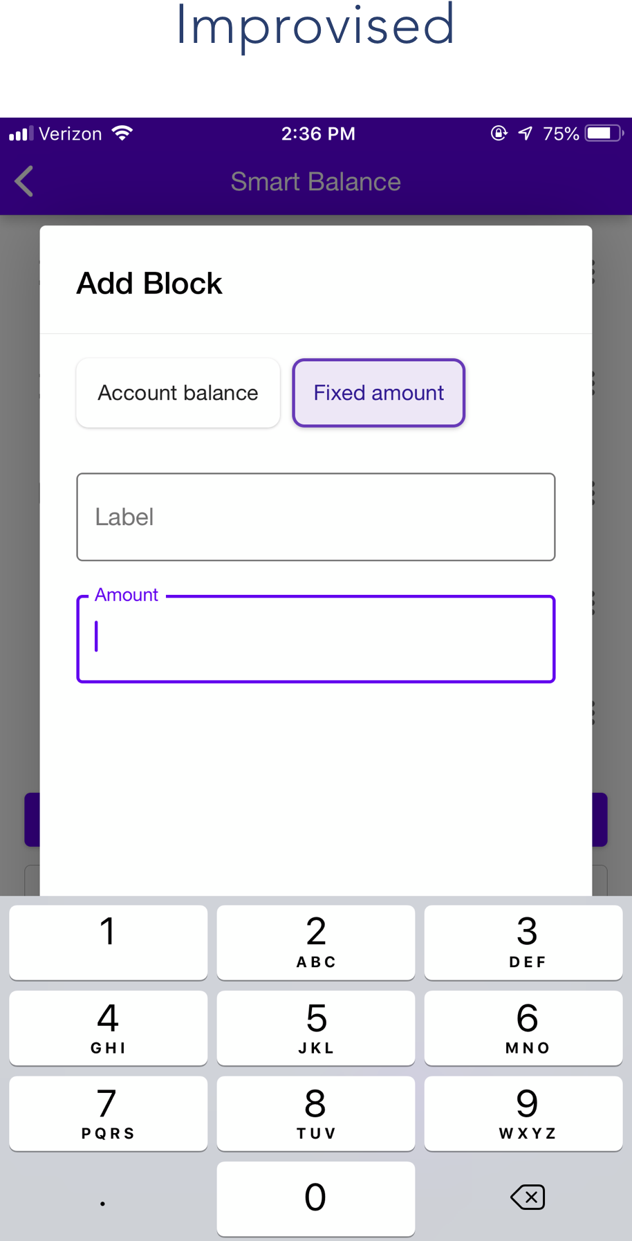
Initially, we were onboarding people in person and explaining to them what Smart Balance is. We would then ask them how they would like to set it, and Tony would configure it for them on the backend of the codebase.
Once we got positive user feedback on this feature and knew it was the right feature to build, we needed a screen that allowed users to configure Smart Balance themselves.
I was working on something else when engineering did a pass at improvising this feature. After their initial implementation, I worked on wireframes and a prototype to make the configuration a bit easier to navigate.
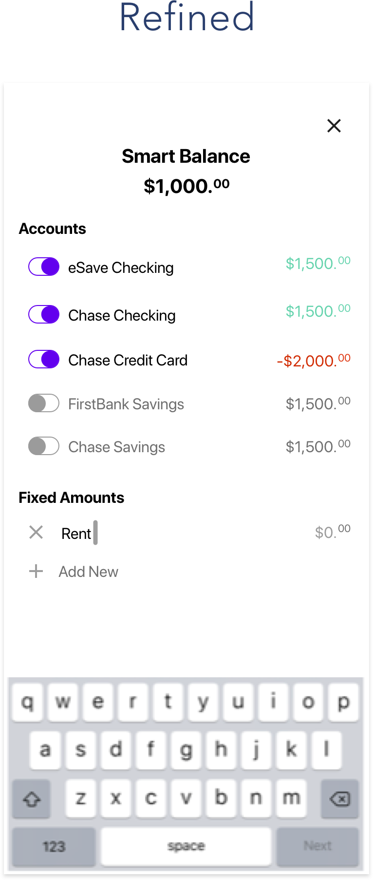
Once we implemented the design system, the UI became much more breathable.
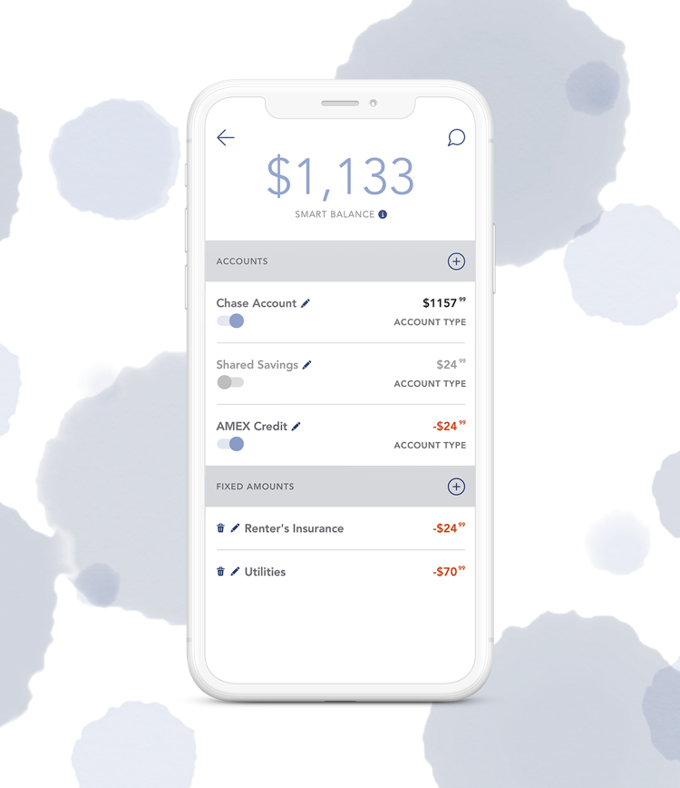
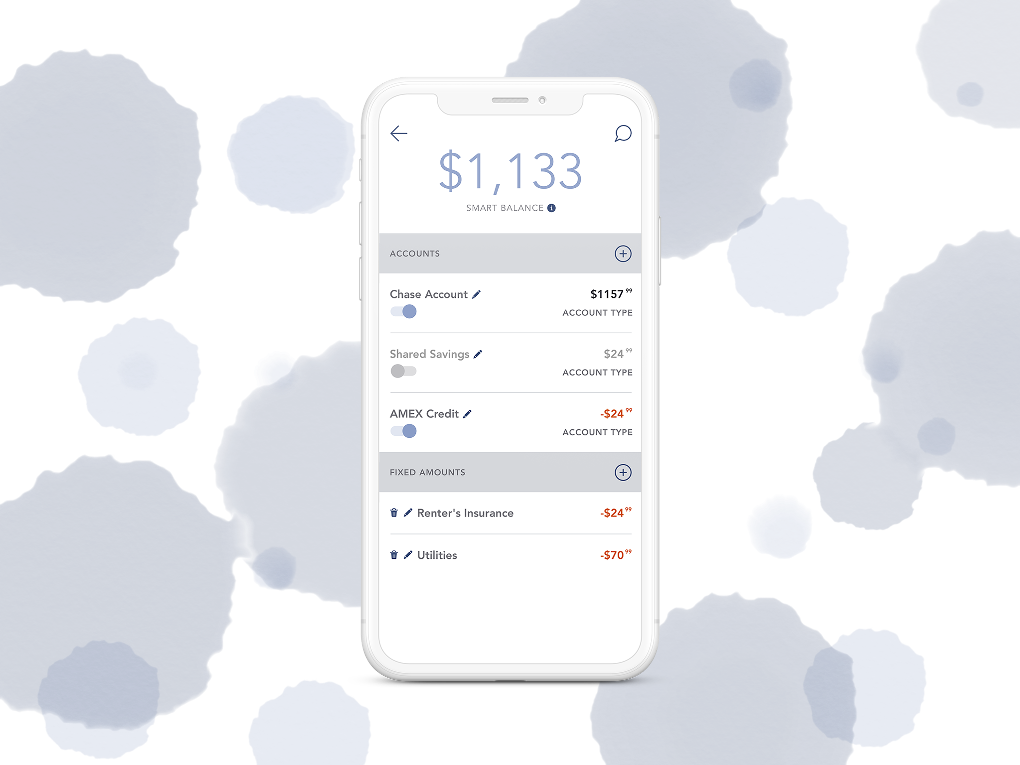
Although we tried to make the customization screen as self-explanatory as possible with default settings and empty states, we found that we still need a more comprehensive solution to onboard new users to this feature and will continue to work on doing so.
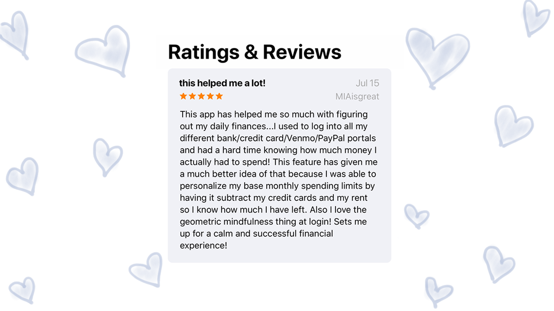
Smart Balance and our emotion-first approach to personal finance has been positively reviewed in the App Store.
I am so grateful to have been a part of this team. This learning experience has been very unique and I really cherish it. I'm going to miss working at alka but also ready to let in something new.