I was the first designer at alka and started working with the company when it was only an idea. The app launched six months after we began working on it. This case study is focused on how we implemented our design system and the overall impact of that process.
I worked with alka's CoFounder and lead designer, Danny Smith, to solidify design principles, branding, messaging, and UI components into alka's first custom design system.
As a company, we had gotten to a point in the alka app where the framework of Google Material was holding us back from having the desired look and feel of the product. Two weeks before launch, we realized the brand messaging and the product's visual appearance were a complete mismatch. As a tiny startup with a design team of two, we had to get this delivered to engineering as fast as possible. This is a story of how alka's design system, wisp, came to be.
A design system is a collection of reusable UI components that, when assembled together, can build interfaces with a range of functionality.
Design systems allow both designers and engineers to build visually consistent products at a faster pace. When design becomes reusable, a product can scale and evolve at a faster pace because it has the structure to do so.
Before alka implemented its design system, wisp, the design process was a very fast, iterative process. The only interface structure that was there was what was essential.
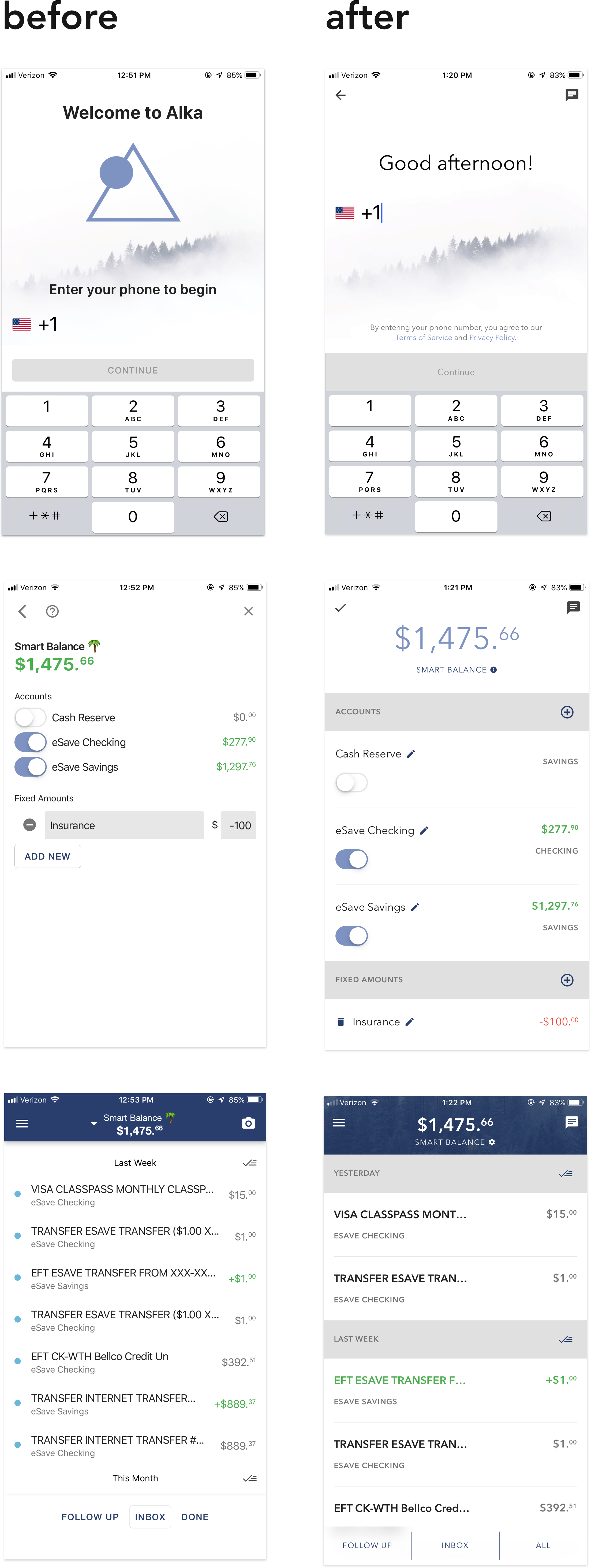
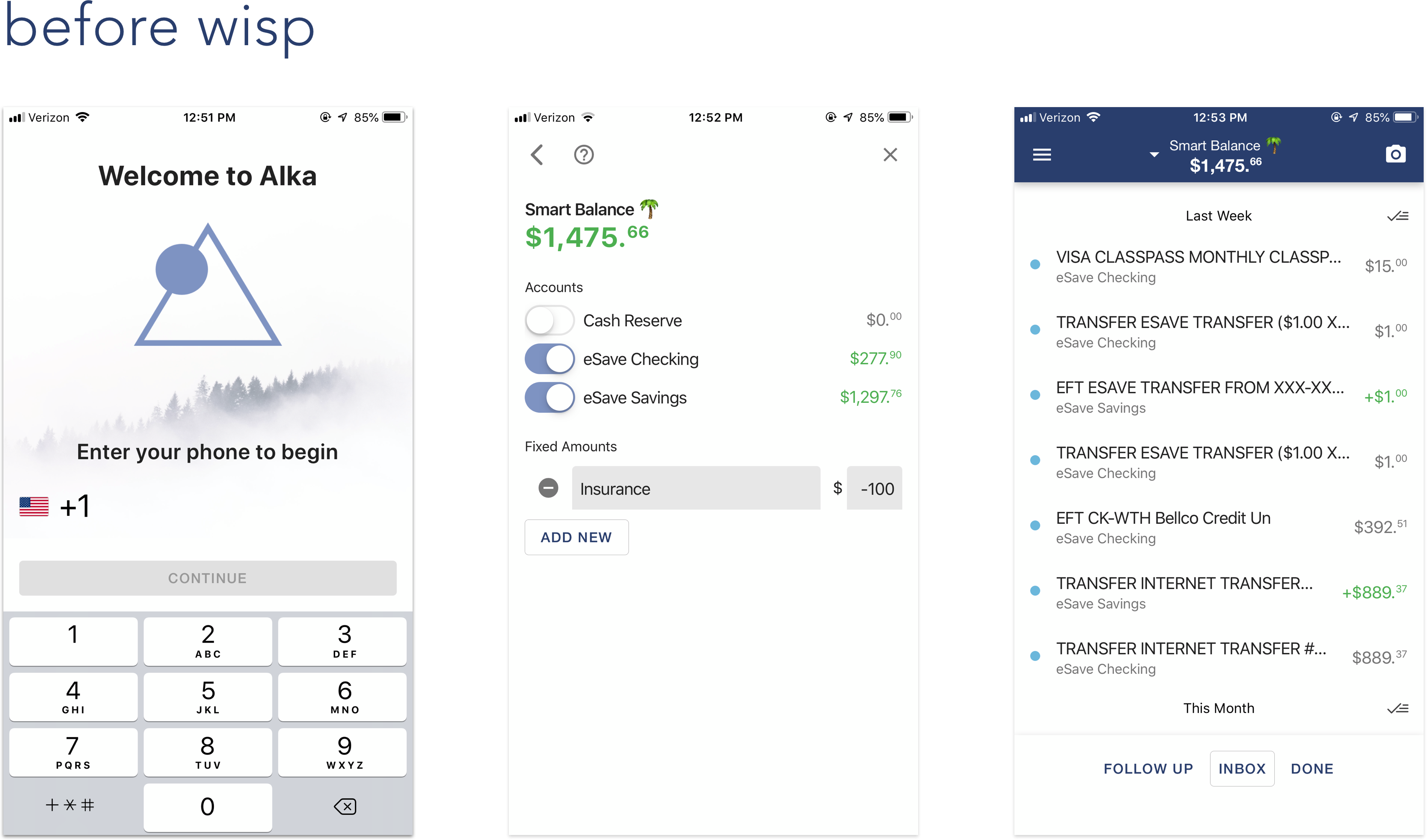
As the company was being built in the first few months, our engineers had a ton of work to make the app function. Having a beautiful user interface (UI) took a backseat when we were testing out new features and trying to make the app behave.
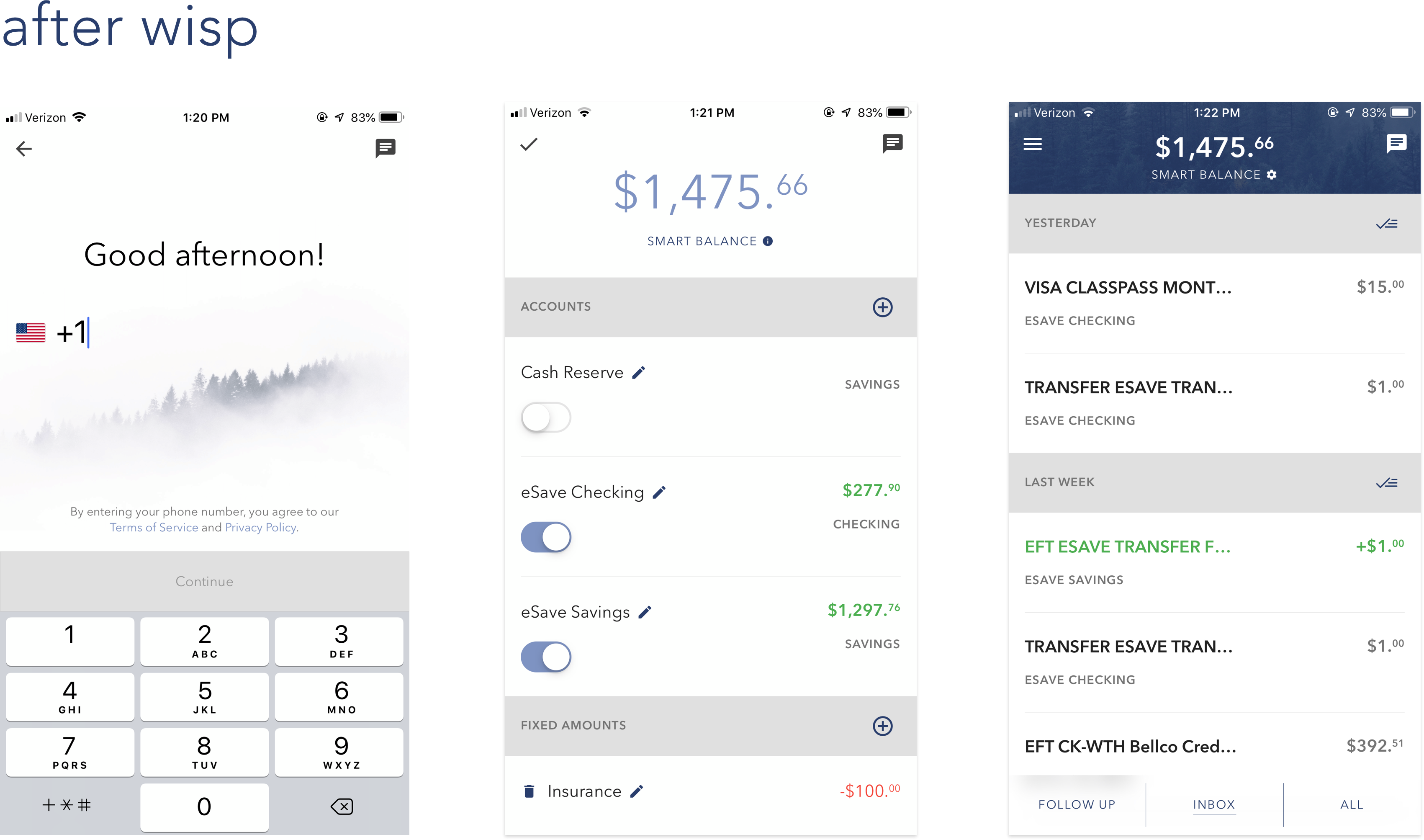
Building out the design system enabled us to deliver a product that fulfilled the promise of being an app to help you feel calmer about your finances. It became a product with little character to a product that had a look and feel. We are now able to iterate quickly on a foundation that gives us something far more beautiful than what we had before.
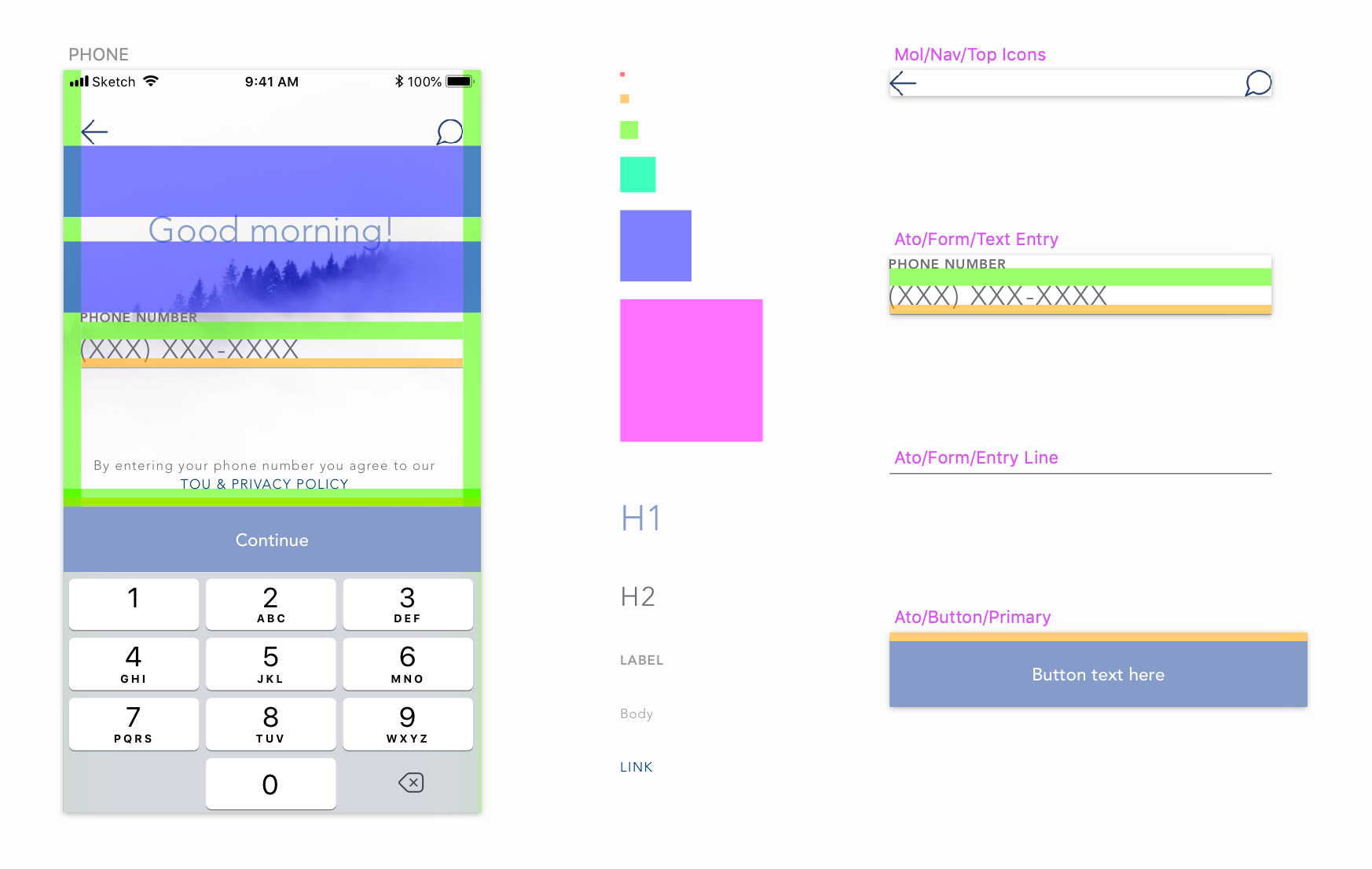
Design systems are iterative and evolve over time. It often takes most companies months to develop a boilerplate design system. Danny and I carved out the majority of alka's design system in a 10-hour day.
We were able to shorten the timeframe for several reasons: first, we were a small team of five people and our stakeholders wanted something that was better than what we had in place currently. Second, we drew inspiration from a UI kit (instead of iterating on countless components from scratch).
Danny & I had high standards because we had worked closely on developing the branding and messaging over the past two months and needed to deliver a product that lived up to that message. Our process throughout the day flowed smoothly because we were in sync with where we wanted to take the visual direction of the product. I had never built a design system before so I followed Danny's lead through the process.
Our day consisted of defining the following:
Building out all the components in a Sketch library took a few more days to complete; engineering had the components in place in a little under a week.
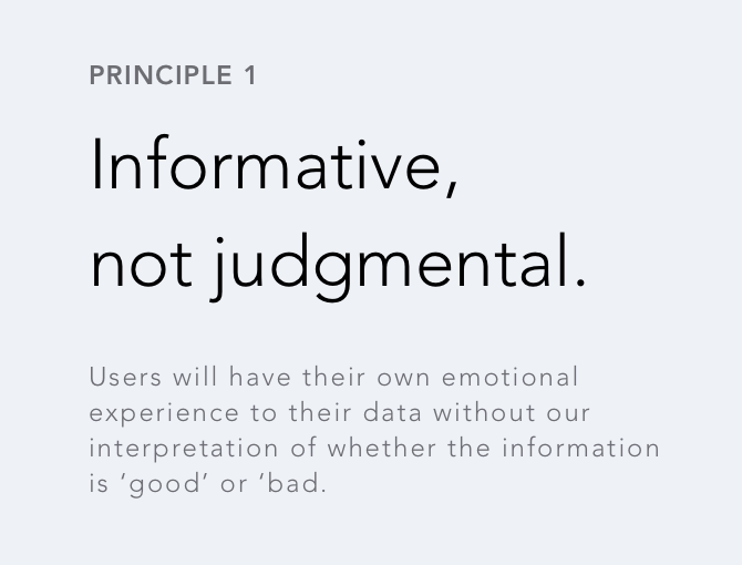
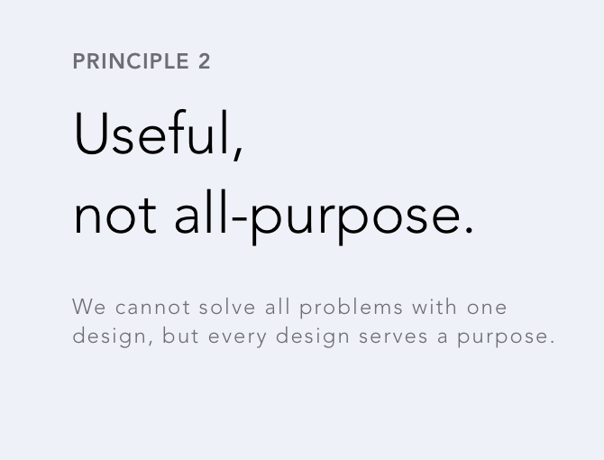
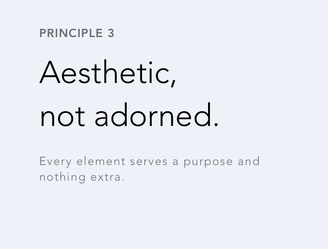
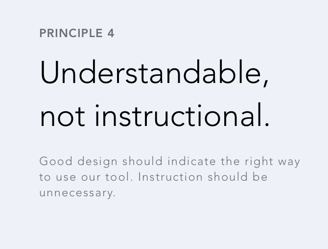
Design principles serve as a guide to measure and evaluate design work. As a company, we had extensive discussions around our messaging and were aligned in making a product that embodied financial mindfulness. Establishing design principles was essentially distilling hours of conversation down to a few points.
As with any classic design process, we embarked on the double diamond going big on all of the ideas and then narrowing down to what was important to us. We first referenced Dieter Rams, and wrote all ten of the Good Design Principles on a whiteboard. To stay true to our identity as a mindfulness product, we additionally wrote down more words that related to emotional health and well-being.
After everything was on the board, we took the ones that felt most aligned with our product and our messaging and put them into "this, not that" statements, which gave us just enough of a range in meaning where we could take the principles and run with them.
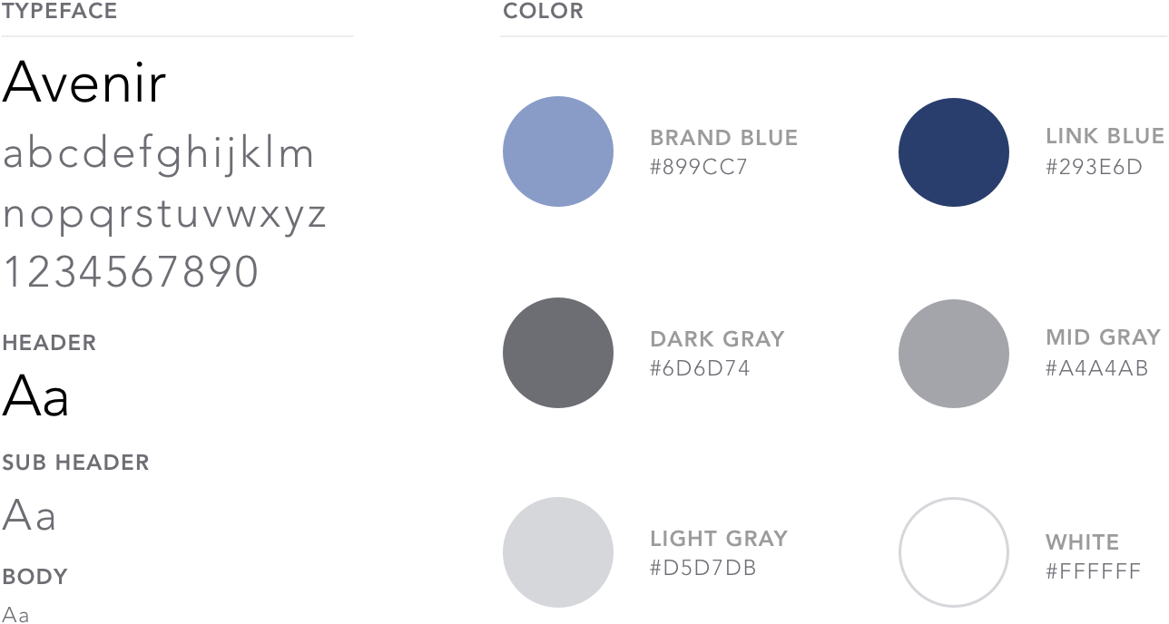
We had already established color and type in our marketing materials. However, the app had more depth and information to consider, so some new colors and text styles were established along the way.
To save time on countless iterations, we decided to look for inspiration from UI kits that had a look and feel we wanted to emulate.
We began by scouring the internet for UI kits and adding the ones we liked to a swipe file. Once we had about eight, we each picked our top two and reviewed them together. We selected the DO UI kit by InVision based off of look and feel as well as its use of specific components we needed (toggle, list, buttons, form fields, etc).
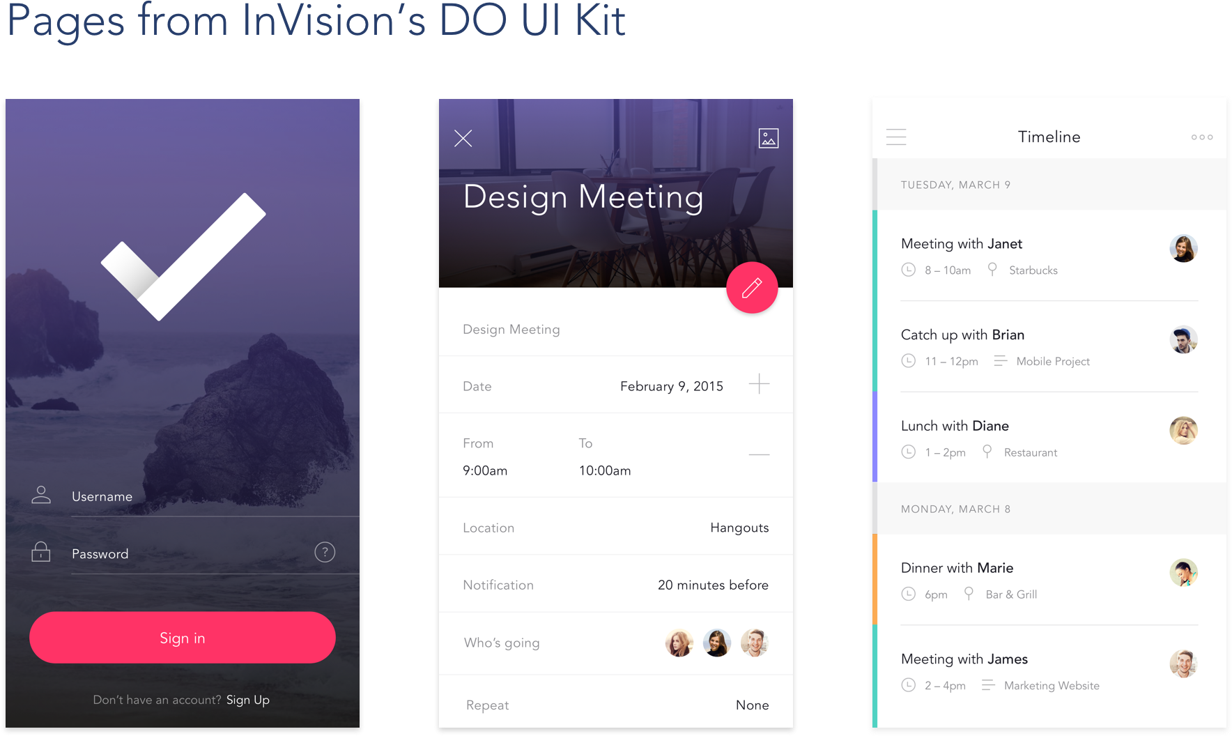
To test our ideas, we selected a page from the UI kit that felt the way we wanted alka to feel: open, breathable, welcoming.
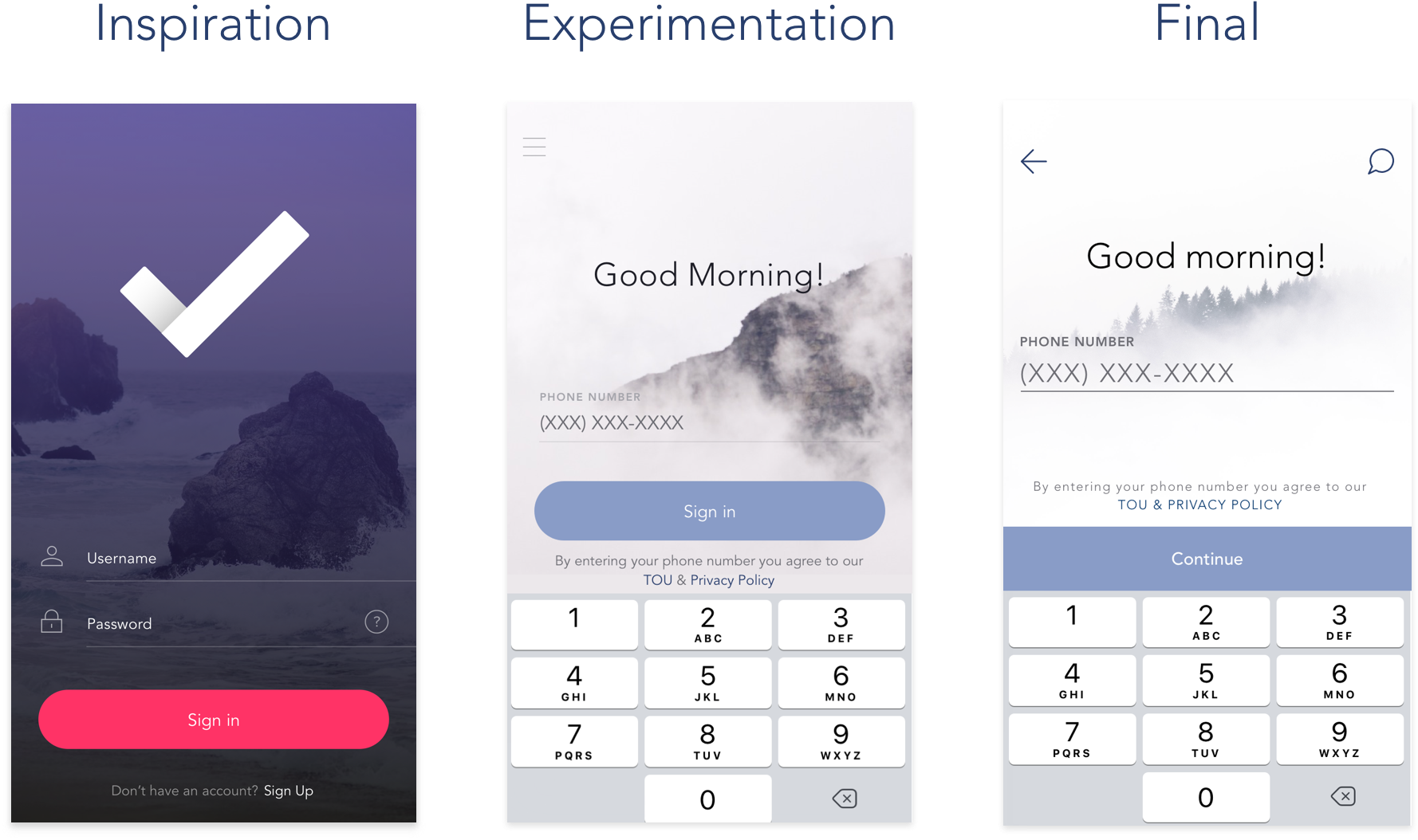
We then picked out specific elements that could be used as inspiration on other key pages and followed the same process of experimenting and refining.
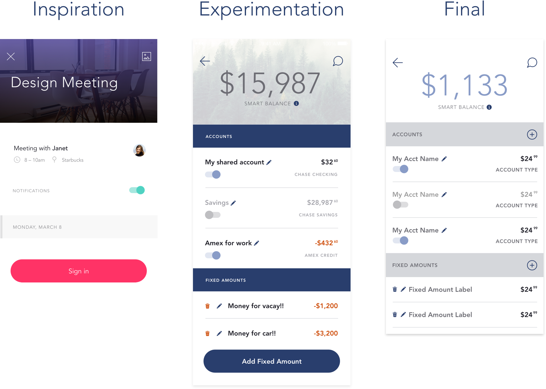
We ran our designs against our design principles to see if they lived up to the standards we set. While not perfect on every point, we did see a path forward to getting them there.
Additionally, we had a check in with our engineers to make sure that we were going in a direction that was feasible for them to build in the short amount of time we had before launch.
When the designs felt good, we picked them apart again and made them into components in Sketch.
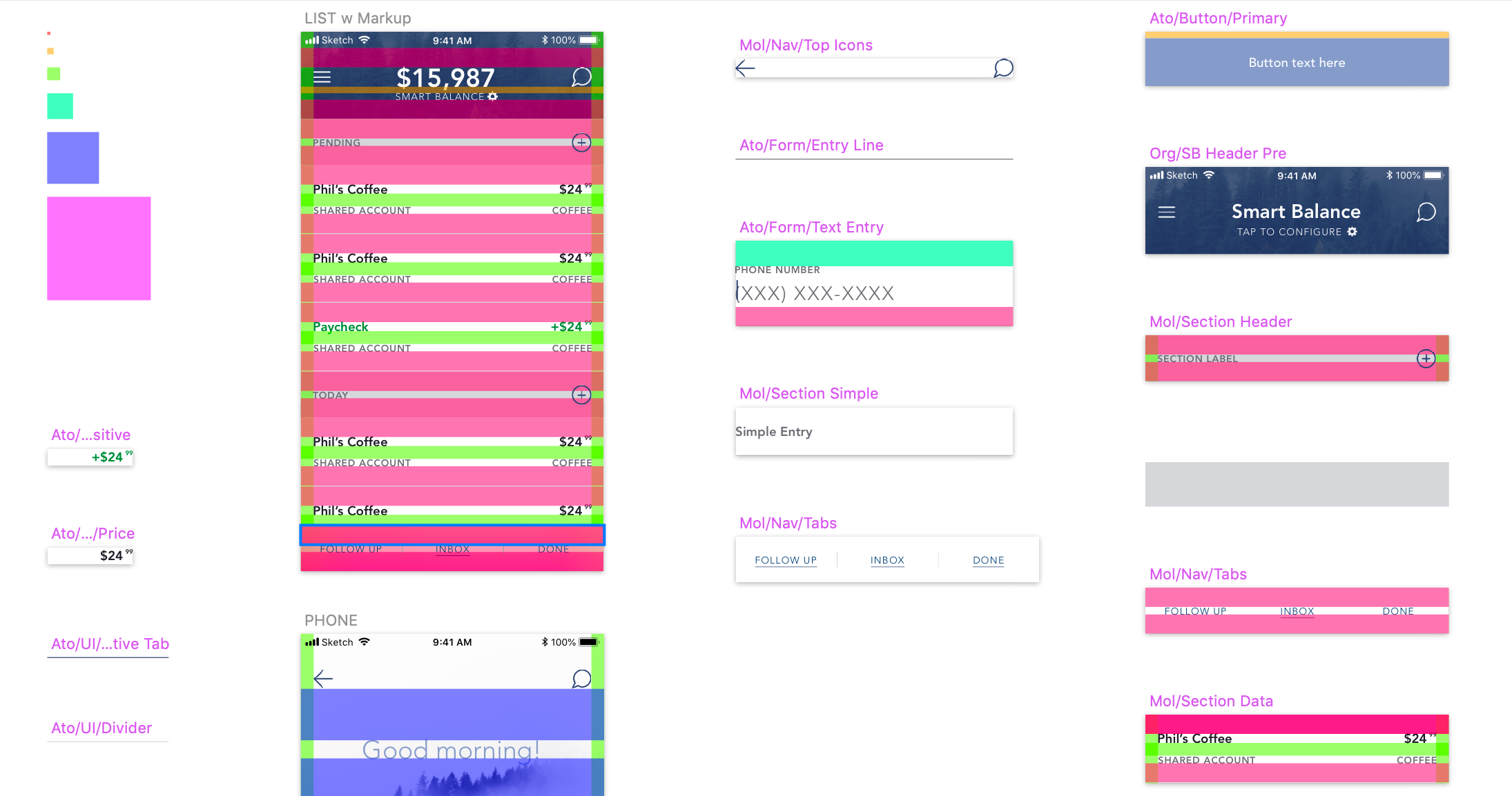
After hashing out the majority of what we needed in a day, we had a more in depth meeting with engineering to explain the components, how they worked, and adjusting the specs as needed. They did an amazing job implementing everything in a very short timeframe, as everything was in place just before launch.
This was my favorite projects while working at alka. I'm grateful to Danny for leading the way so I could learn what it takes to build a design system and also how to use and operate within one. It would have been wonderful to spend more time on certain elements, but I also know that this system will only continue to grow and perhaps be overhauled again for something new and explored in greater depth. It was rewarding to produce something that had a huge impact on the product in only a day.