
I was asked to create a unified error-reporting system that was to work across four departments in commercial banking. Designs were completed in 7 weeks.
I led all research and usability tests. I created flows and interactions within the application and restructured the information architecture of the previous prototype. I collaborated with Katie Yamasaki on the final layout and visual design.
When a small business goes to open a new checking account, they have to fill out a very long application which then goes through a series of checks within the financial institutions (KYC, AML). Errors are often found in these applications, but the technology used by bank employees only allows an error to be noted on the entire application instead of the exact field where the error occurred. Once an application is sent back, another internal department has to go through dozens of pages to find exactly where the error occurred.
As a result of this, some customers are held up for months before their account can be opened.
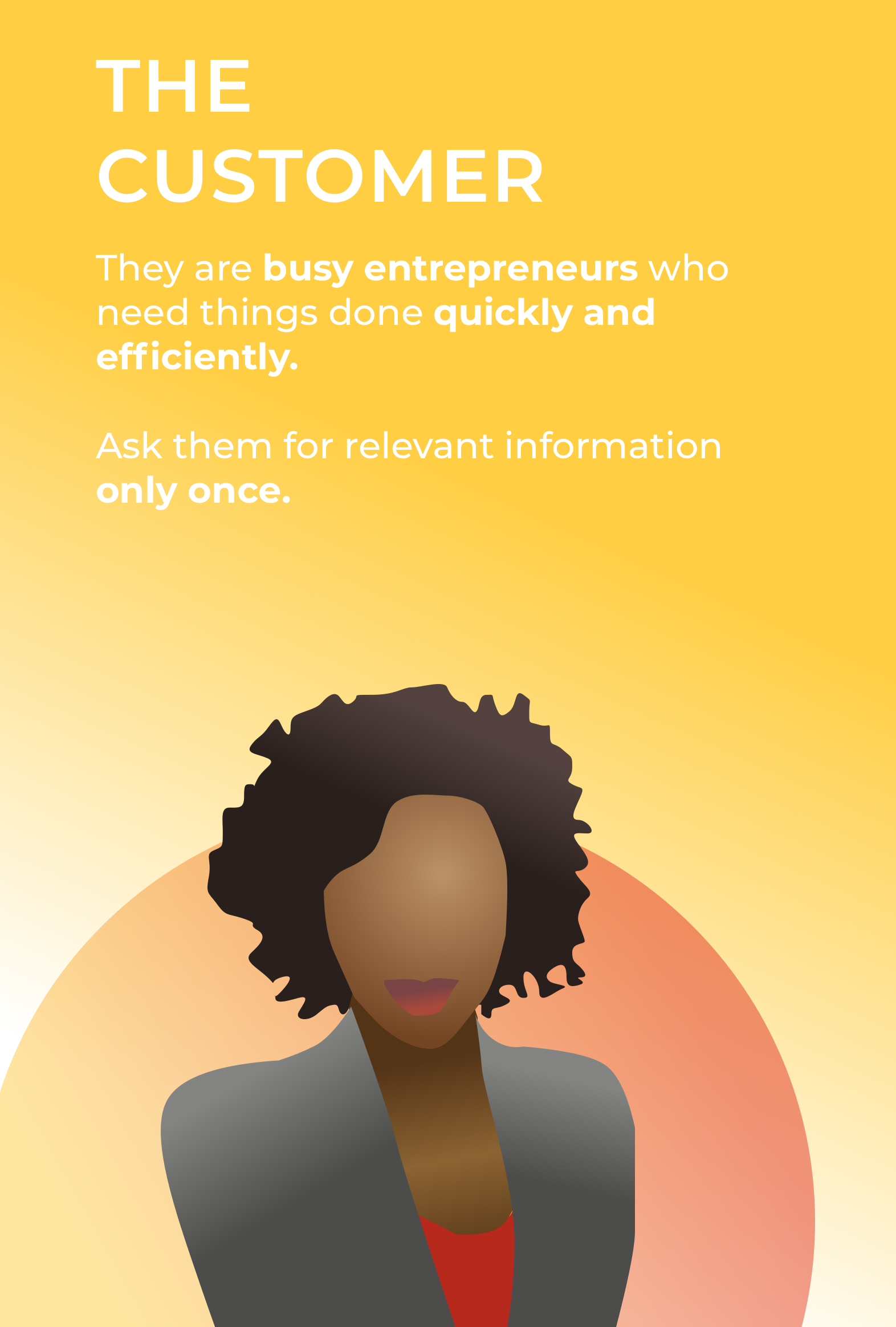
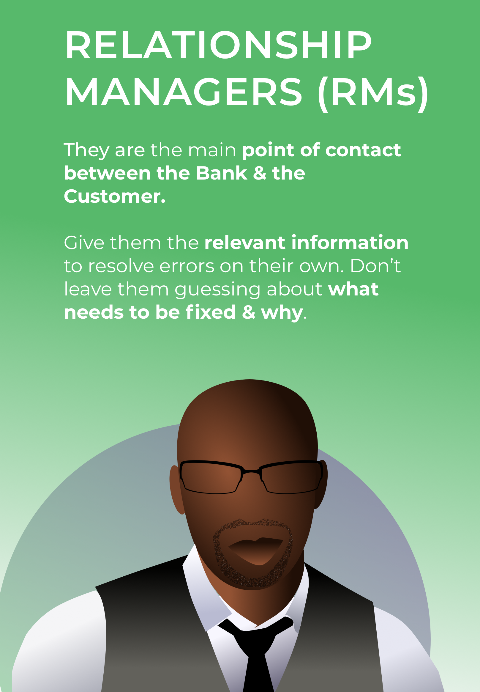
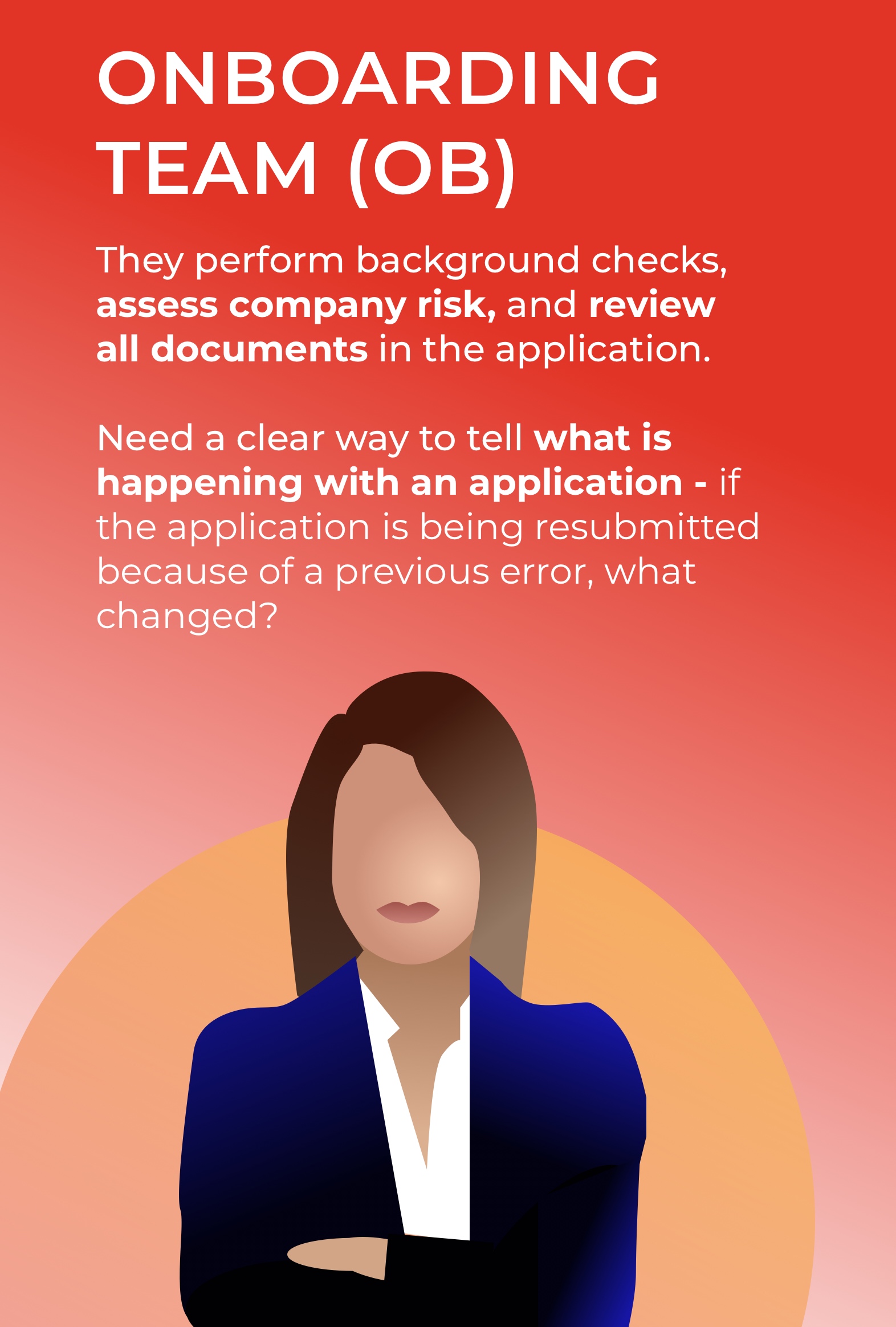
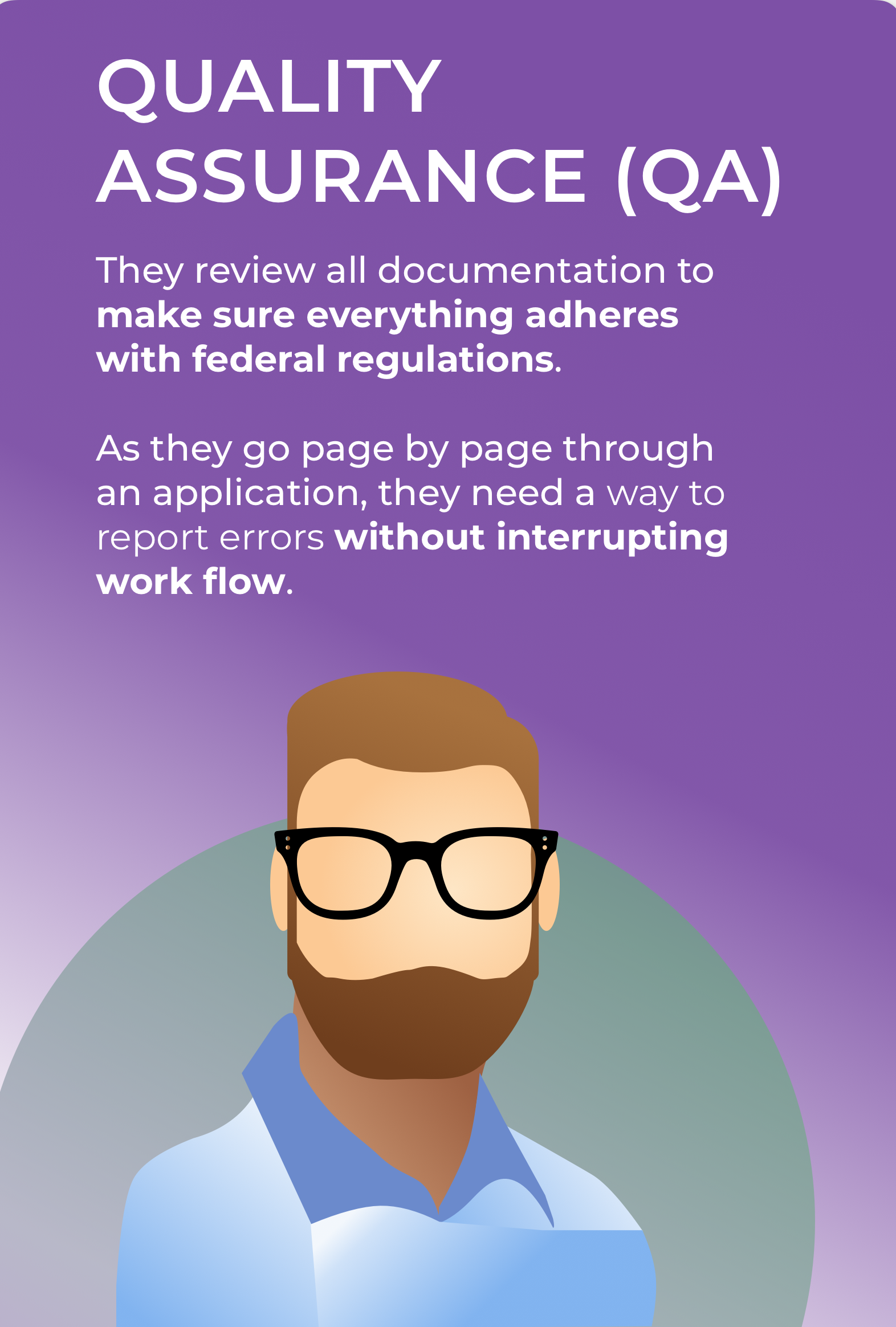
The system had to work for four different groups of people, but only three departments (Relationship Managers, Onboarding, and Quality Assurance) would actually use it. The system would ultimately have a direct impact and benefit the Customer.
As I thought about the problem, I kept returning to a question:

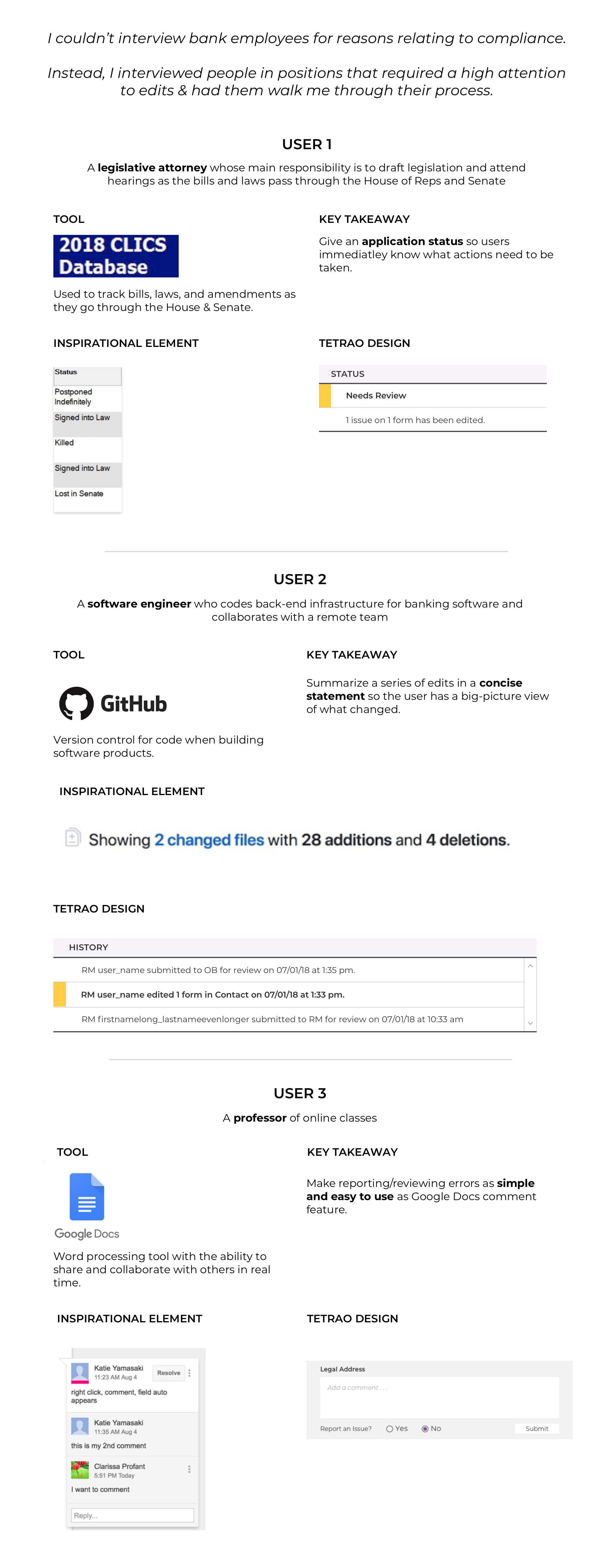
I started off by A/B testing two paper prototypes with a very simple scenario: I asked users to find and report an error on a single page of an application.
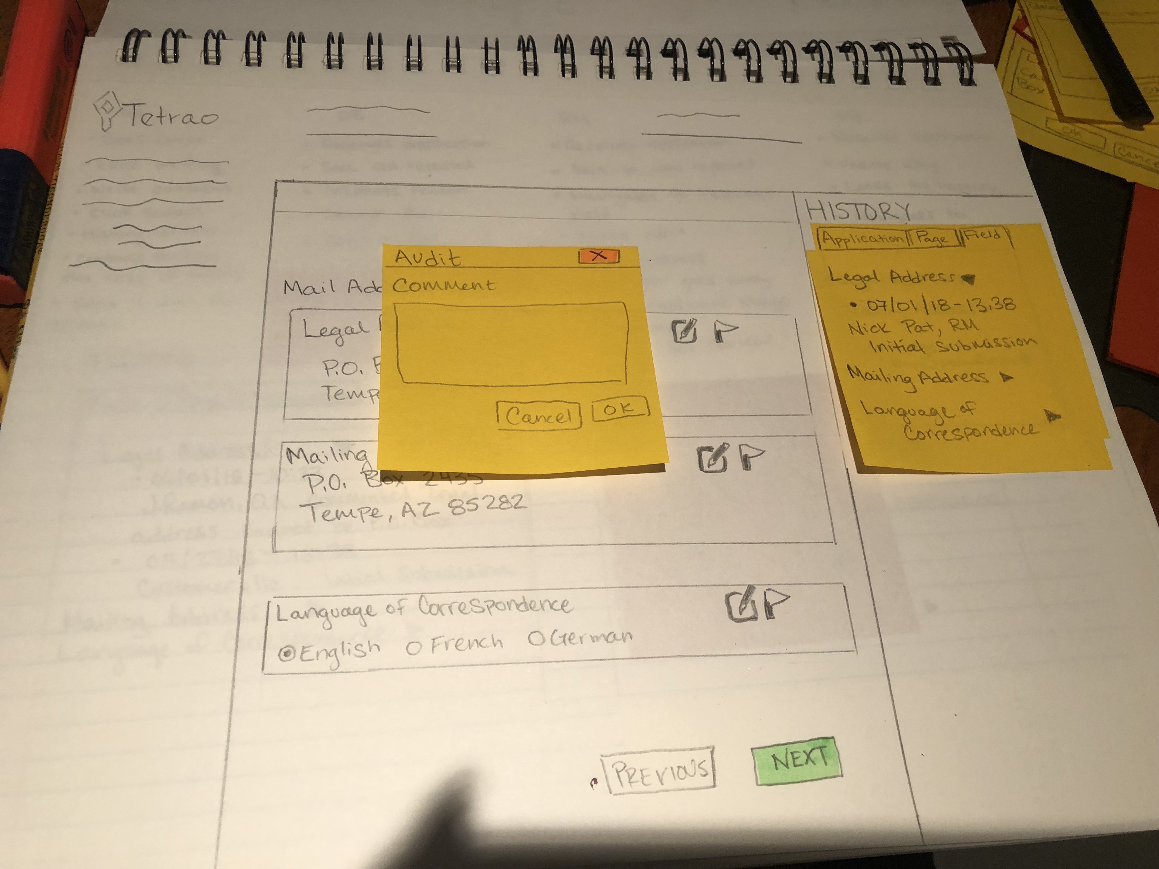
During user testing, I found that each person clicked the field that had the error first. They also liked having the history visible on the right and wanted to interact with it.
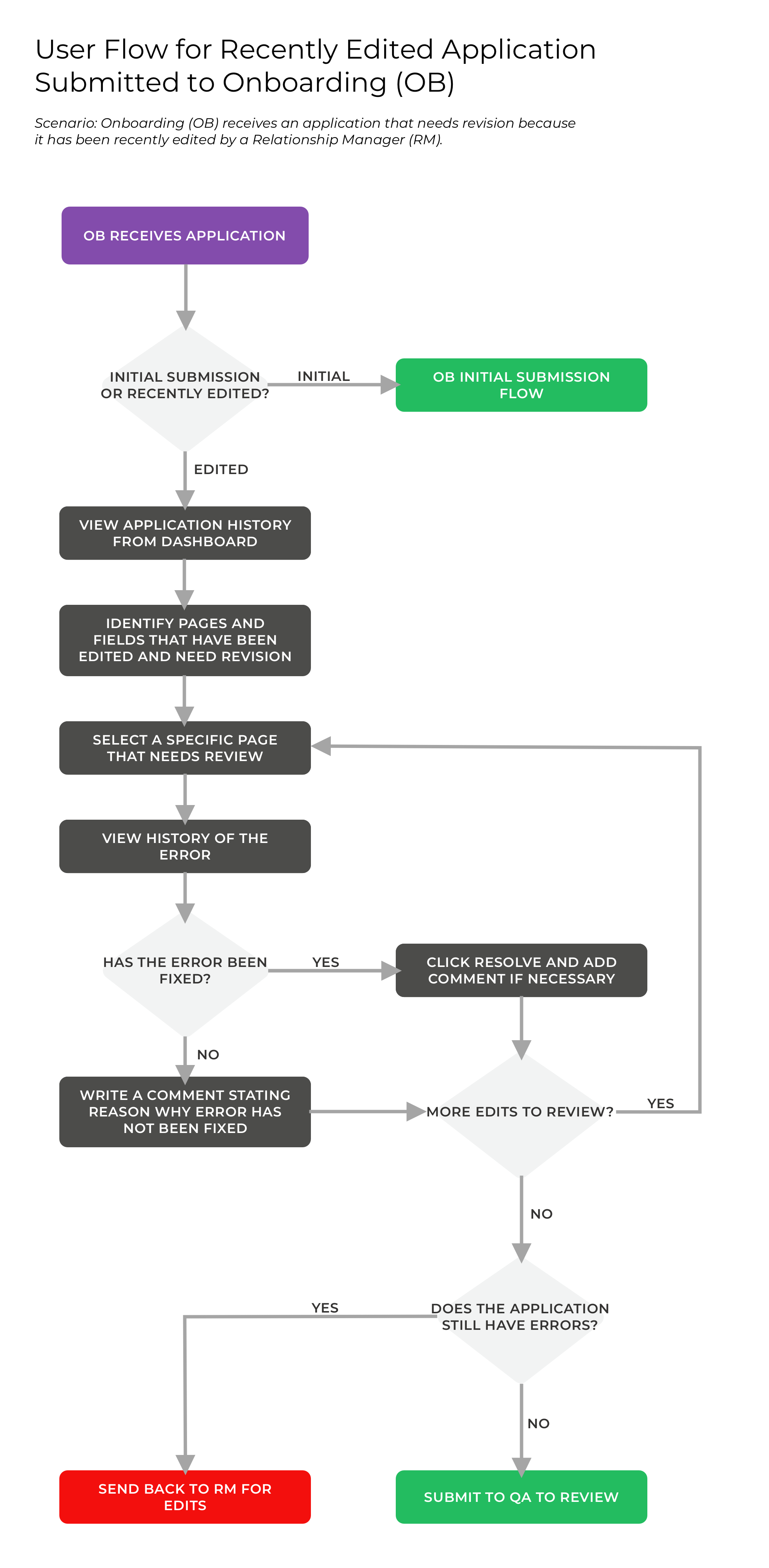
My first usability test allowed me to move forward with having users click a field to report an error. However, the reality of the problem was more complex, and I had to expand the scenario to include all the various roles that were unique to each user's corresponding department: reporting errors, editing fields, and approving resolving errors. User flows helped me immensely, as I was able to figure how each user would handle an application in various situations.
Testing these flows with clickable prototypes was crucial, and also tricky. I learned that giving a detailed scenario of the situation was essential, otherwise my testers would be confused about what they were supposed to do.
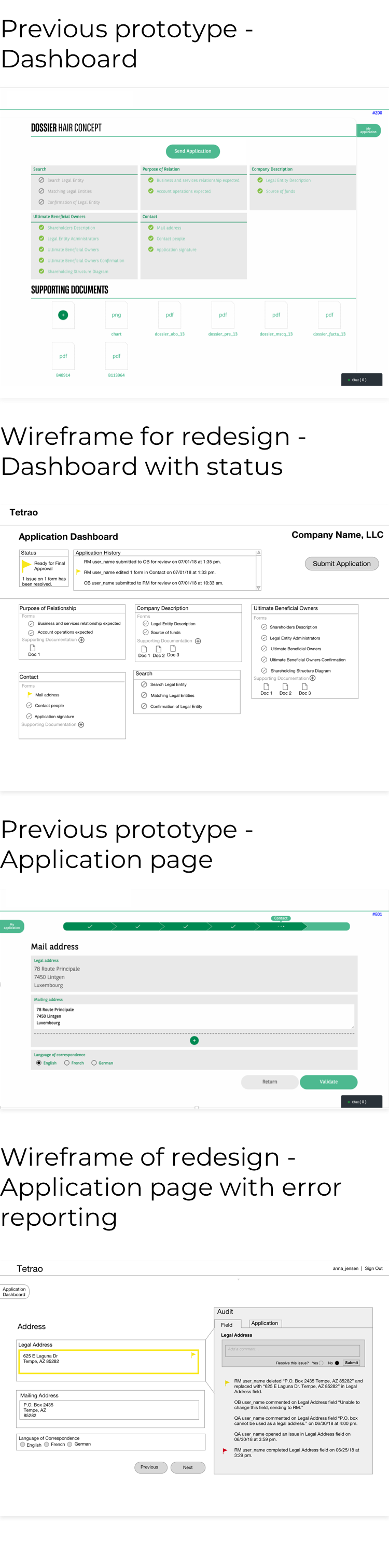
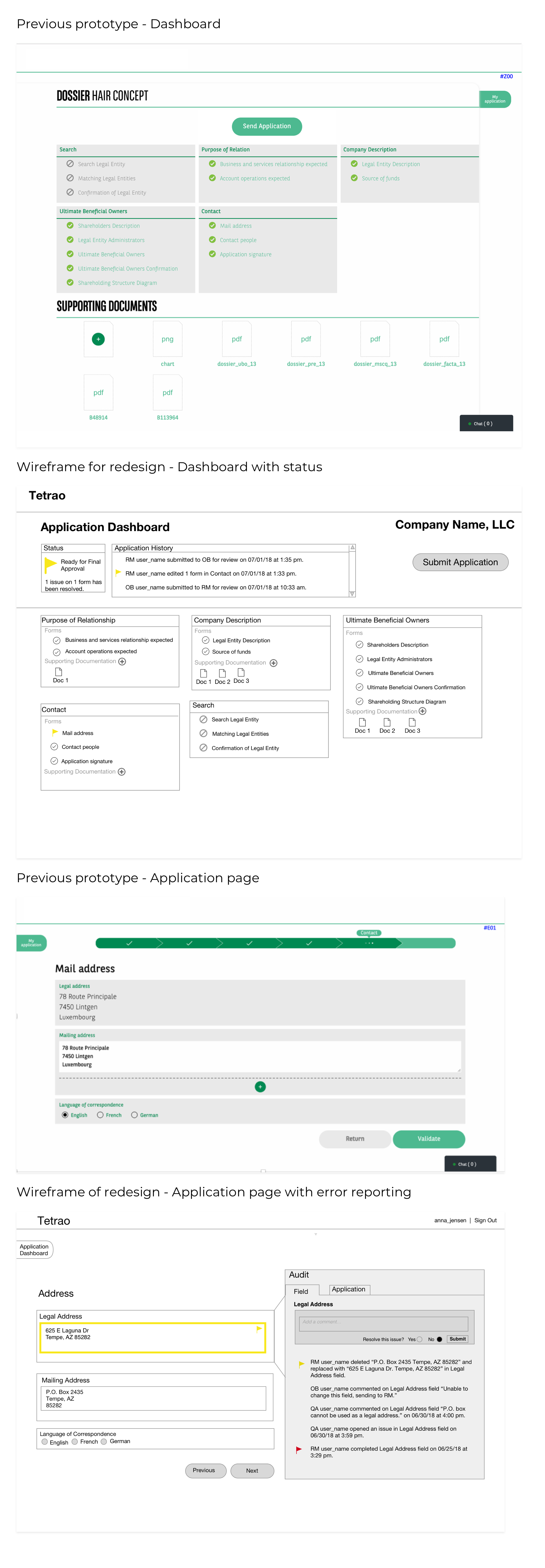
Tetrao wanted the solution worked into a redesign from two pages from an existing prototype they made.
In the previous design, I noticed that:
In the initial redesign, I decided to:
My teammate, Katie, led the visual direction for the final mockups. Tetrao's original prototype was in Bank of the West/BNP Paribas branding, but they wanted the final design in Tetrao colors.
Tetrao did not have a style guide or branding. We worked with the CEO to come up with some basic options from scratch.
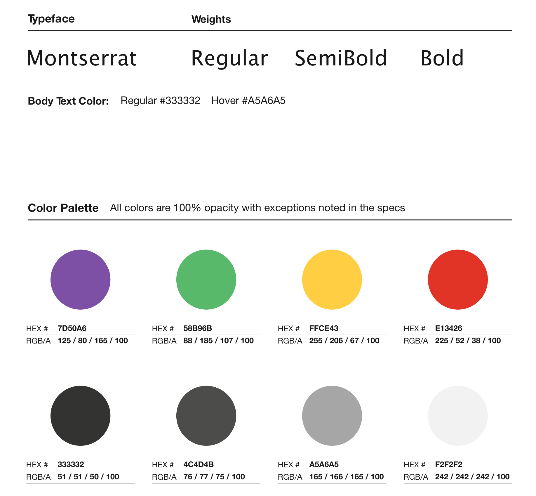
While many financial companies use green in their branding, we decided on purple as the primary color for its correlation with royalty. By coincidence, Montserrat (the typeface) shares a name with a mountain in Europe that was of significance to the CEO.
The final designs give the user the right amount of information. Color blocks are used to direct the users attention to places that need review. The application and field histories are formatted in a way that give users a micro & macro view of where errors occurred and why.
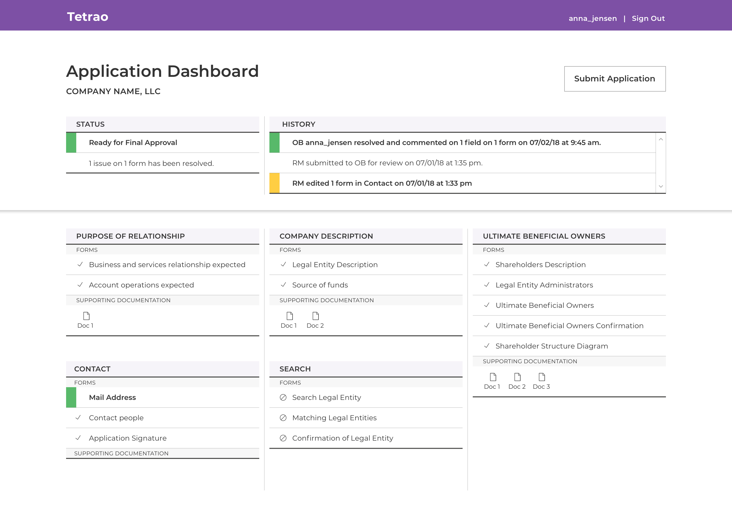
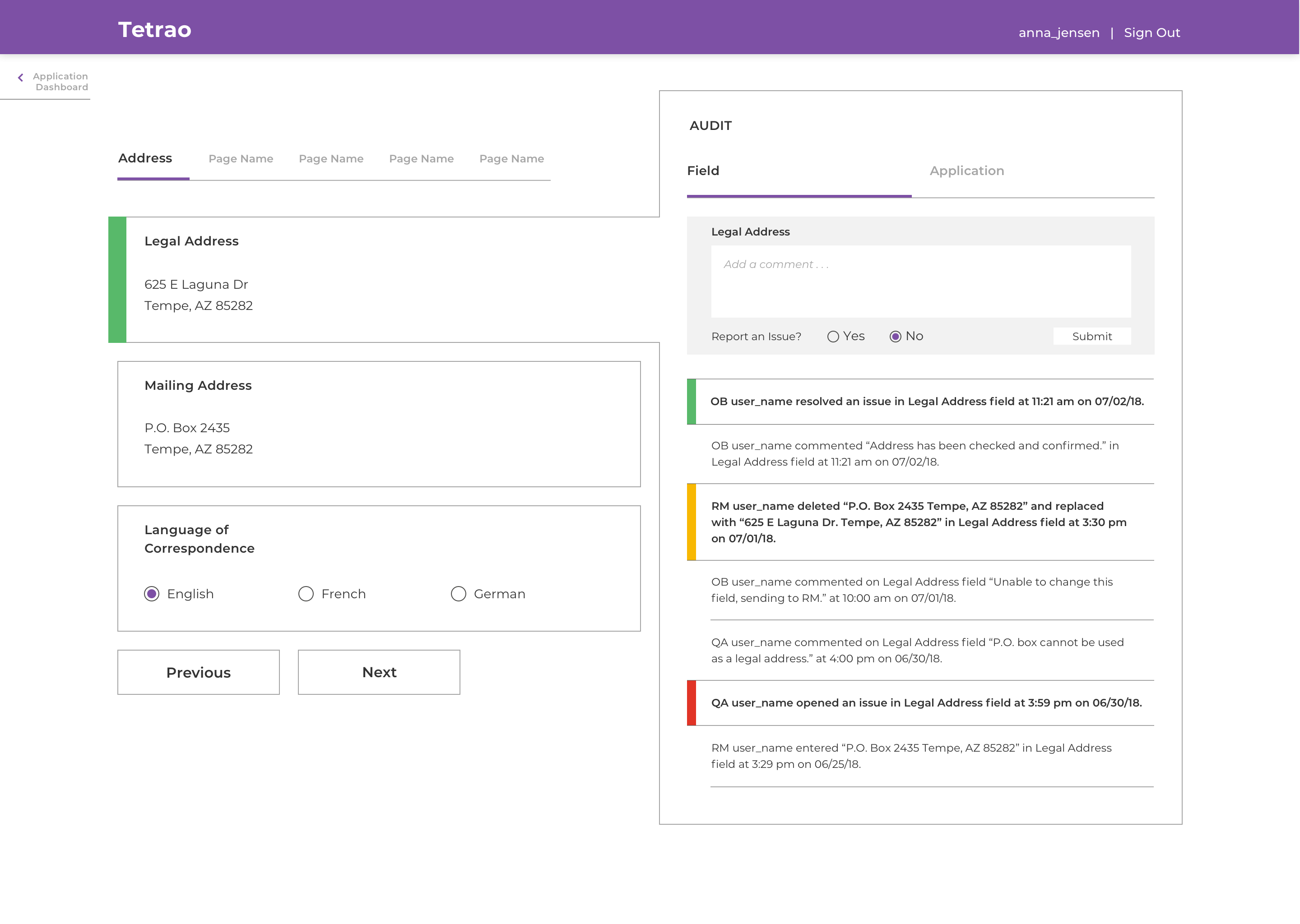
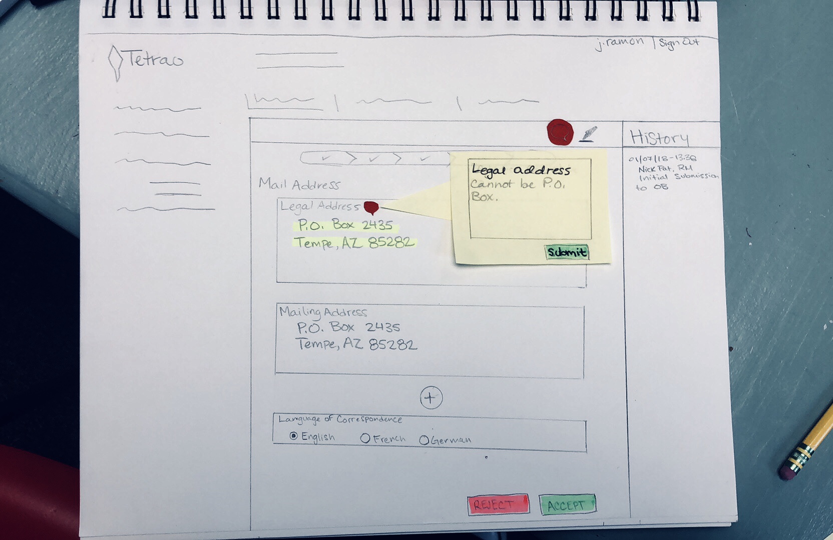
This prototype walkthrough demonstrates an application with an error that has been sent back and needs revision. In this case, Onboarding department sees that a Relationship Manager has edited the Legal Address. Onboarding can see why the address was flagged in the first place and confirms that the new address is correct and has been checked. The timeline and dashboard update accordingly to reflect that all previous errors have been revised and are ready for Quality Assurance.
If given more time, I would like to further experiment with solutions beyond color and copy to make the error status clearer.
This web application is anticipated to take the commercial banking application process from 3-6 months down to 2-3 weeks.
This project had me think about how technology and the interfaces in which we work create an environment and an emotional impact. By creating a product that reduces visual noise and a flow that integrates the users goals (as opposed to having separate task flows), I can imagine one's work day would improve significantly.