
When I started at Bank of the West in 2019, I was the first product designer solely dedicated to producing designs for Mobile. Other designers at the bank had contributed to projects that went into Mobile, but there had not been a dedicated designer to really focus on and understand the product as a whole.
Over the past two years, my most valuable contribution to Mobile has been the work I put into its design system. This design system was once scrapped entirely by a new design director and then revived because its foundations were too strong to overthrow. It has weathered not one, but two migrations into Figma and a brief stint in inVision DSM. There are processes and governance worked into its foundations. It is building towards a harmonious design direction that will unite the design language of Mobile with Online Banking, Onboarding, and DOTCOM digital products. I think the biggest tribute to its success is that I am no longer the sole contributor to it - all Mobile designers have contributed to the design system and been a part of its process and governance.
I began building the Mobile Design System out of pure necessity. I did not have a style guide to reference when I started working on Mobile. I began with a comprehensive audit and a small library in Sketch that attempted to consolidate the inconsistencies I found in the audit.
My boss, Janet, guided me and the growing Mobile design team to work component iterations and testing into our process on every new project. We also began conversations with design system leaders on other digital products to slowly work towards more harmony in design language across all digital products at the bank.
I am currently the holder of the Mobile Design System (e.d.s) and in charge of its overall direction and governance. I have overseen its transition from Sketch to Figma and made sure it was rebuilt properly. I lead React Native developers in its implementation. I am starting to work a new 'Bluesky' direction into the design system to help designers build their current designs towards a future direction to inspire creativity and contribute to the ongoing vision of Mobile.
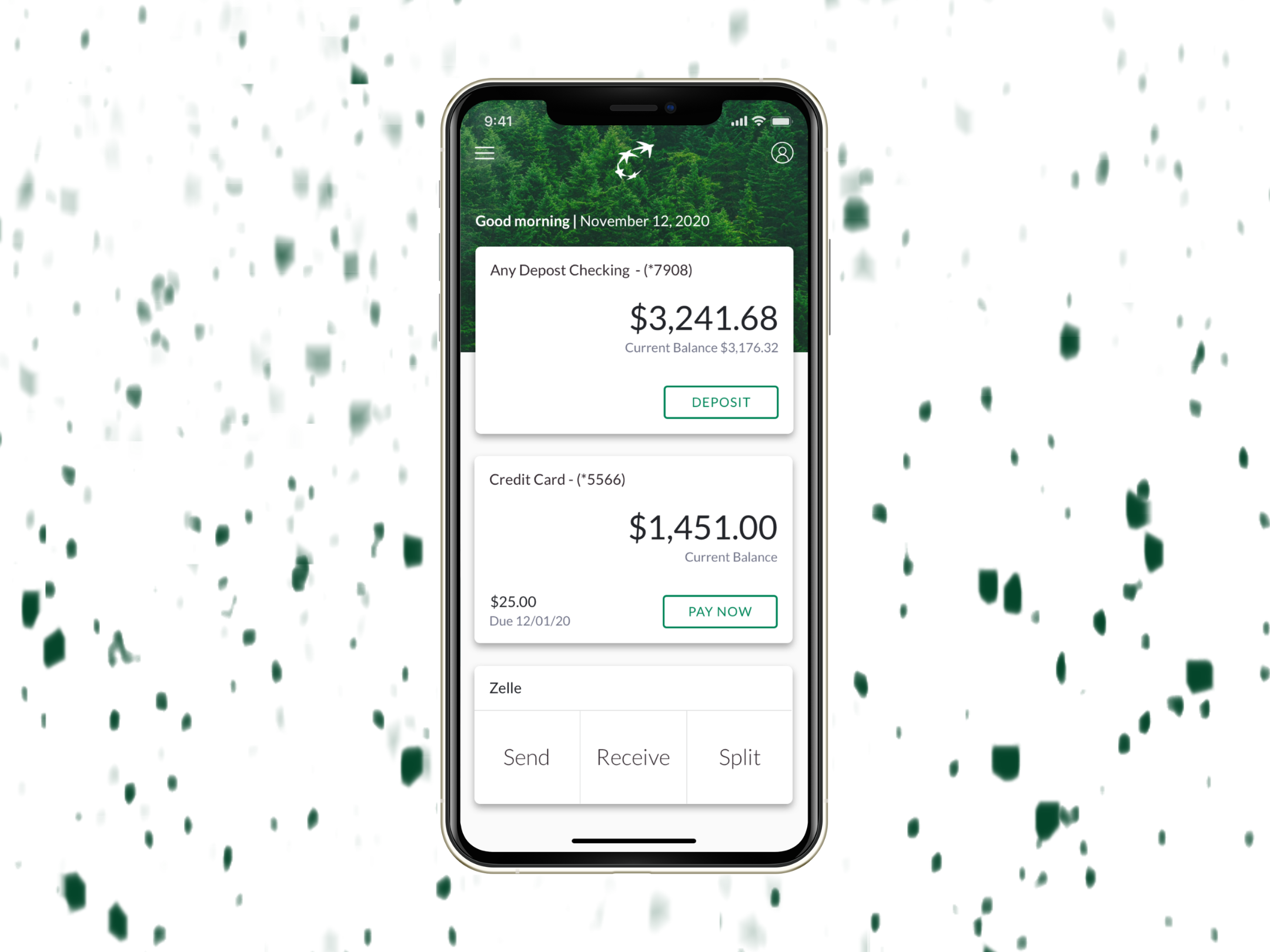
The Mobile app was, and still is, an absolute technical beast. It's hard to figure out what is going on with this Frankenstein banking app from a design perspective. There are framed-in mobile browser experiences that link to Online Banking, a completely separate digital product with its own design struggles. Transfer and deposit flows are from third party vendors with not so great APIs that are constrained in their ability to customize to brand. Zelle® looks like it was built in 2007 with developers calling all the shots. I noticed a difference in typeface on the Account Overview screen between iOS and Android. I learned that developers did not build with components. The core app does not have an existing design system or tokenization in the codebase, so nothing can be changed at scale.
The newer designs that went into Mobile were projects given to designers whose primary focus was on marketing or other products. They were instructed to reference a design direction put forward by an agency to re-design Mobile. I found the agency's work to be mostly unhelpful, as it did not even scratch the surface in understanding our technical constraints and implementing its guidelines 1:1 would only add yet another entirely different design direction to the jumbled mess.
I needed to create accurate design specs to hand off to our developers. If I used a header from the agency's 'Design System' they handed off to us, it would look entirely different from what the developers were building or able to build. The need for clarity and consistency was essential.
Without an accurate style guide to reference, my work on the design system began with hunting to find the value of Brand Green. I found dozens of similarly-hued greens in an extensive audit of the product. I also found countless type styles used in different and opposing ways, icons that didn't relate to each other at all, buttons in different colors/type treatment/corner radii, among many other things that would make a designer cringe.
What do you do when there are so many greens? Initially, I picked the most common green. Upon testing it for ADA contrast, I found that it actually wasn't compliant. The green in my library documented both the ADA compliant green and the other green that was most prevalent with a note that it was for reference. This specific green was in all the headers and the background on the Account Details screen - so we couldn't immediately ditch it.
I audited all major UI elements from foundational elements (typography, color, icons) to basic components (buttons, fields, list items, cards etc.) I was trying to make sense of any sort of consistency or direction. I didn't find what I was looking for, but I did come out with a pretty clear understanding of where things lived and potential 'easy fixes' that could go a long way in cleaning up the design.
Tap the image below to see examples of BAU (business as usual/current in production) screens of the Mobile app:
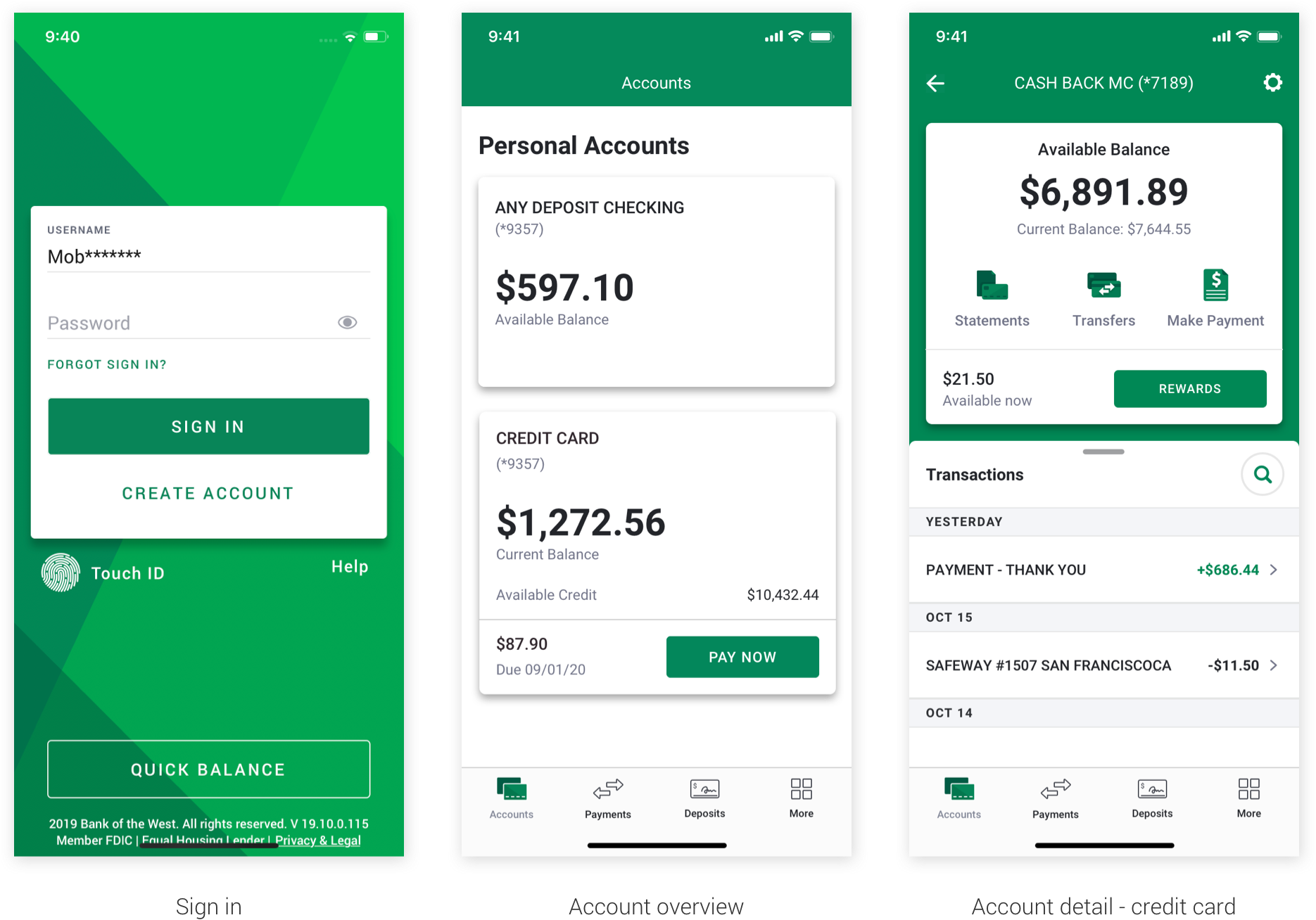
* All screenshots were taken on test devices with fake account info. *
I began the library in Sketch to help with my own projects, and definitely had been slacking on adding new components and styles once it got to a certain state. But Mobile was growing. The team was now up to four designers, and Janet and I were noticing more and more small inconsistencies across our projects.
After taking some time to add new styles that had been implemented in recent projects, I connected with my teammates and coached them on how to use the library. While initial buy-in was hesitant by some members, everyone began to rely upon the library more and more. The styles and components were worked into all our projects - while not every project was fully attached to the library, most elements were linked.
Tap the image below to see more of the Established Design System in Sketch:
The extra tricky thing about our process was that dev was not componetizing with us. This is a whole other story that I won't go into here, but I'd like to emphasize this point and say that any adjustments we made to patterns had to be harmonious with its predecessor.
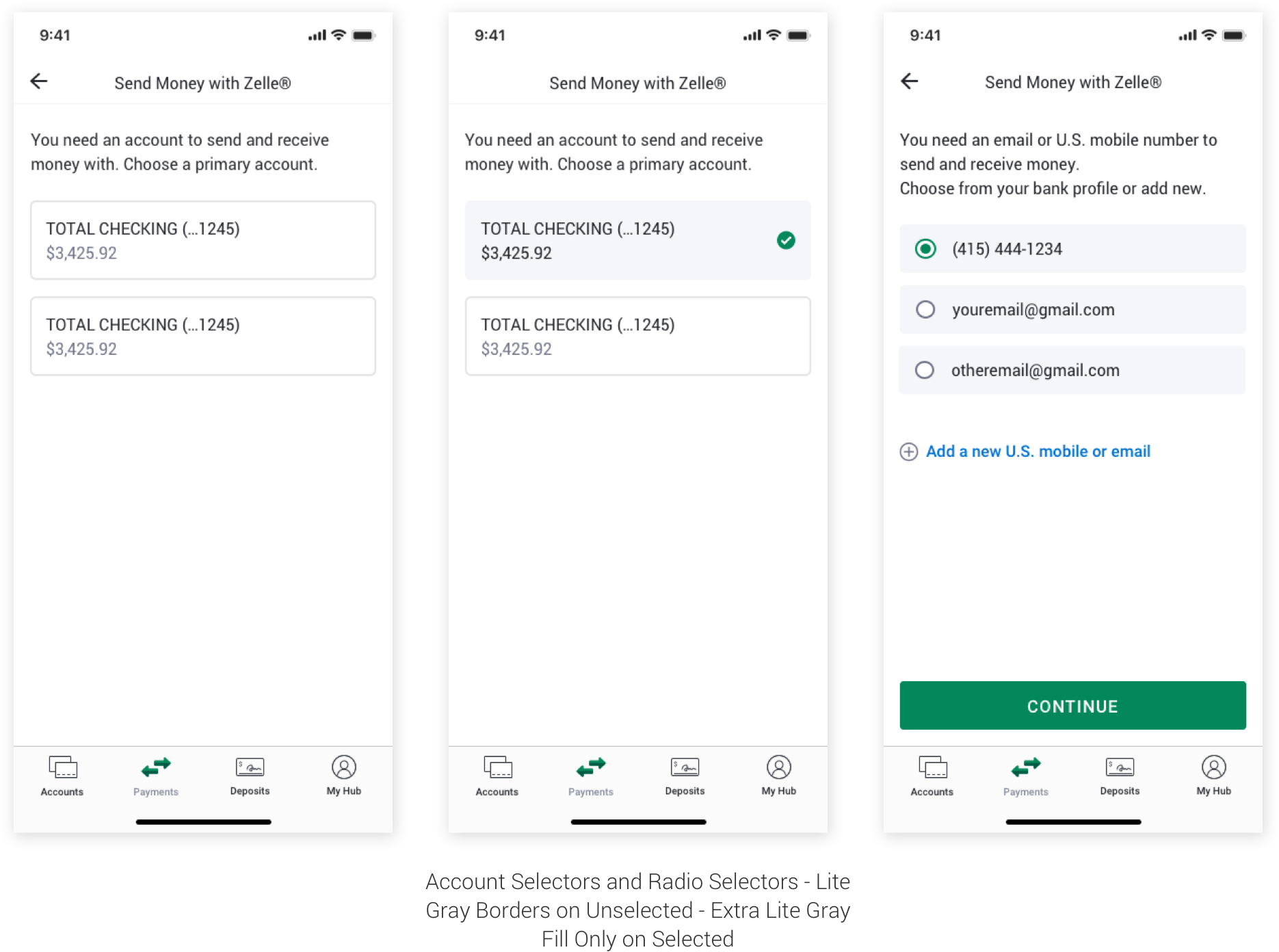
Because we were establishing the precedent of a design language that could harmonize with current patterns, component iterations were built into our workflows. If a component or a pattern did not exist in design that was recently implemented, we had to iterate upon how it would look and then test our ideas in other parts of the app. For example, we initially only had a single radio button with a line of text, which made the element appear a bit too floaty. I looked at examples of other selection components (in this case, our account selectors), and tried different UI patterns to see what felt the most harmonious.
Tap image below to see an example of component iterations for account and radio selectors:
Janet held meetings with all design system leaders for other digital products across the bank. We would share about components we were working on and naturally pick up on ways to harmonize the design. Radio buttons were a great example for this in Mobile - when Onboarding came up with a 'Gumstick Radio Selector', it fit into Mobile with a few seamless adjustments. It also solved the problem we were having with floating radio buttons not feeling quite right in implementation.
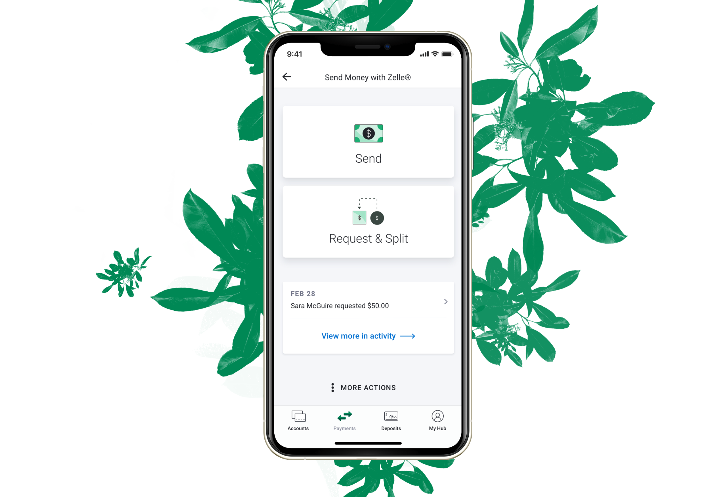
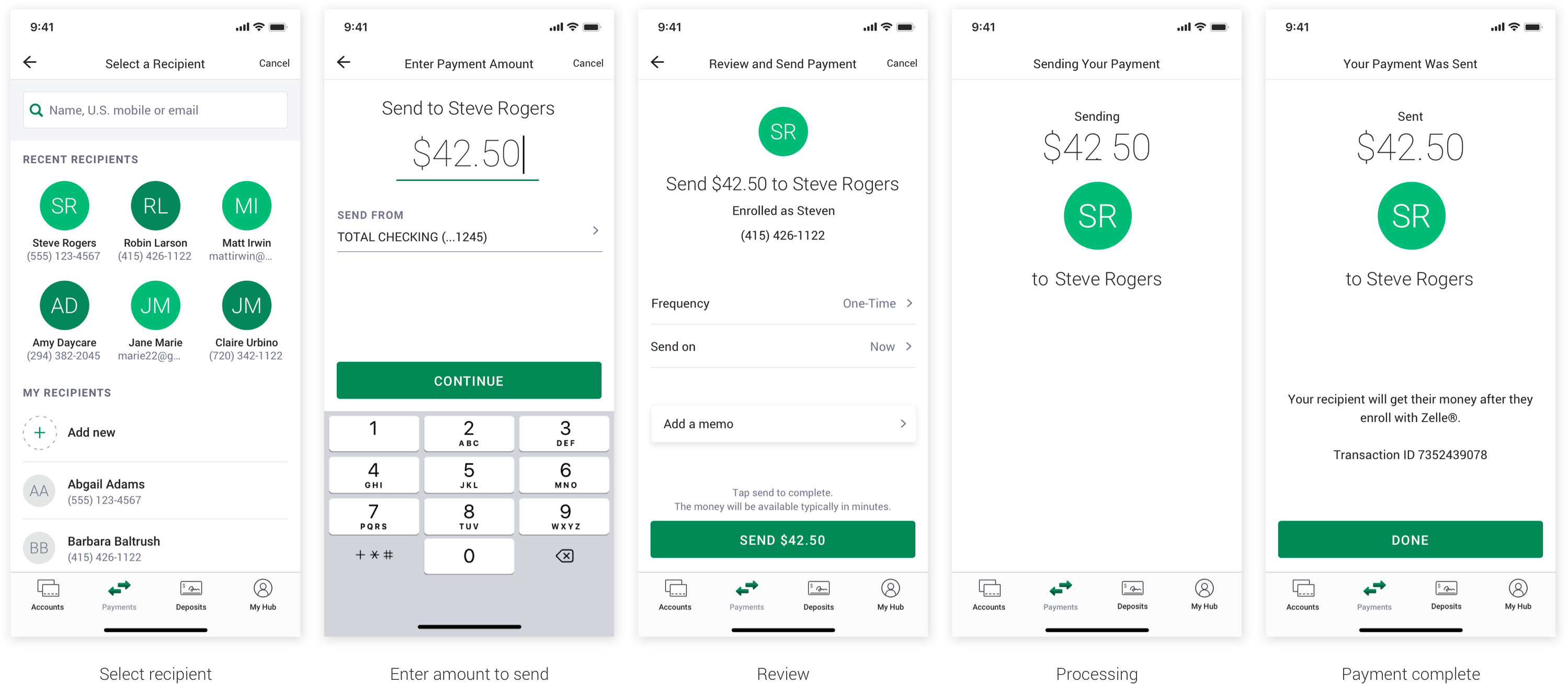
I was lead designer of the biggest digital initiative for the Bank in 2021, the redesign of a P2P payment app called Zelle® (see full case study here.) Zelle® is the first digital initiative in mobile where the bank was able to have developers build components. Everything was going to be net new and serve as a foundation for the future of Mobile. I was able to push the design system to its limits and expand it.
I was moving Zelle® (a project with about 200 documented flows) forward when the person who was helping me with the Design System went on paternity leave. Left to my own devices, I didn't have the luxury of time to build and iterate on components the right way in the Established Design System. Moving both the backend and front end parts of a project was a lot to carry, and the perfectionist in me was screaming every time I had to make a choice for speed over accuracy.
You couldn't tell from my specs in Zelle®, but I definitely left a bit of a mess in the Sketch library. This all happened around the time we decided to transition to Figma with very little warning or preparation. The port from Sketch to Figma didn't go well, and the Established Design System and my Zelle® files were littered with thousands tiny imperfections.
I went back to Sketch and spent a week revising my files, swapping out components. and mostly cleaned up my mess. Unfortunately, by the time I finished, I was too late.
About a year after its inception, the Established Design System was being used by four Mobile designers and worked into countless projects. New components were being added with the Zelle® redesign that added a fresh new perspective based in the foundational elements. We were working towards a larger vision of uniting the digital products in foundational elements and other design patterns. Then, new leadership came in.
New leadership decided the entire Established Mobile Design System would be scrapped and replaced. The 'New' design system that was proposed was created by contractors who worked in isolation from the Mobile design team. When the team finally saw the designs, it was completely different than the design patterns we had established. And very, very gray.
The reality of the Gray Design System that leadership proposed was that it quite literally could not be implemented on a technical level (re: the codebase still wasn't componetized). In addition, a lot of projects coming through the pipeline involved small features that would live around elements in current design patterns. The team was in an uncomfortable position of having to either use the Gray Design System directly upon the Established Design System patterns, or, advocating to use the Established Design System for the sake of creating visual harmony.
Upon the quick exit of design leadership, I was asked to revive the Established Design System.
Two new team members had started during the time when all of the current Mobile designers' work was getting scrapped by leadership. All members of the Mobile design team were idle for more than a month while contractors revised the projects we had built in the Established Design System into the Gray Design System. Our newest members were rightfully very concerned about the job they had just committed to. Then, Janet (my boss, our design manager and our biggest supporter) left. The week after her departure, the design director resigned.
In the aftermath of the design director's brief tenure, the Mobile team was in shambles. We had a Gray Design System in Figma that didn't look anything like our product, as well as a completely broken Established Design System in Figma, and a functioning Established Design System in Sketch that needed time and attention to clean up.
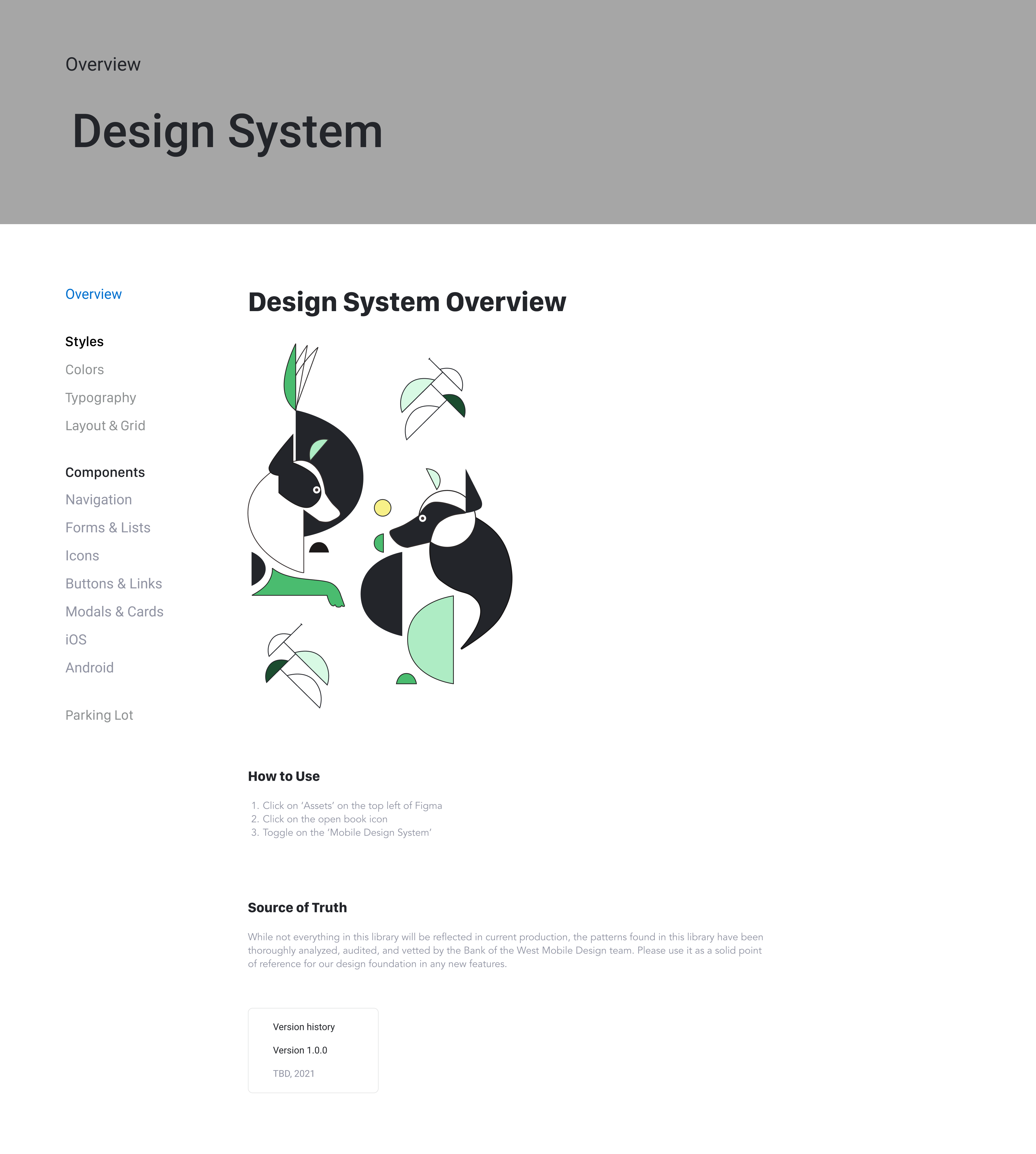
Shortly after leadership's departure, I was asked to take the lead on establishing the design direction for Zelle® (the biggest digital initiative for the bank in 2021) and decide which design system we would run with. I diverted back to the Established Design System and scrapped the Gray one - its foundations were completely different, it was done in isolation, and very few elements/ideas could be used. I oversaw the rebuilding of the Established Design System in Figma. After several months in limbo, the Mobile designers finally had a working design system in Figma they could use for their projects.
Tap the image below to see more of the Established Design System in Figma:
Working through the absence of leadership, not having an accurate design system to reference for projects, and re-establishing processes was hard for everyone, and particularly challenging for the new Mobile designers. I connected with them on a regular basis and heard their concerns, even though many of the things they expressed were not things I could fix, they at least felt heard. The biggest challenge for them was the lack of overall direction.
I remembered that back in December of 2020, Janet had asked us to spend some time thinking about what we would want the app to be like if we had no constraints. She called these 'Bluesky Visions', and it helped me stay inspired and motivated in the face of taking on projects with limited budgets or lots of technical constraints where I couldn't do the right thing for design. We were able to use this work in a meaningful way by taking its elements and adjusting them to something we called 'Mobile 3.0' work - an enhanced design experience from the BAU and a reasonable goal for Product to work towards.
Tap the image below to see more Bluesky and Mobile 3.0 work:
This way of working with our designs is really powerful and influential - even though we are bound by a lot of technical constraints, these designs catch the attention of executives. It is an excellent driver of conversation and inspiration because they see the potential. It further motivates to our partners in Product to push or development partners to modernize.
What I love about this process is that the future influences the present just as much as the present can influence the future. They can each play off each other and in the end, make all design stronger.
I am currently working on processes to incorporate future designs into the design system. While this is not conventional design system practice, I think it is an important beacon of light for our designers to feel that they are working towards modern design despite being constrained in a legacy foundation. They are able to take ownership in that direction based off of their own experiences working with it.
The top learnings from this experience have been:
When I think about what's next, I hope to explore what I am capable of in an environment where I feel supported by well-established processes and team hierarchies. I want to know what it feels like to have the time to really think through a project instead of being in a position where I need to react and respond quickly. I am curious how my design process would change and grow if I was able to focus on building upon a product that already has visual consistency. I hope to bring the people who use the products I design into more focus in my design process again.